Grace City Church, located in the suburbs of Sydney, NSW, Australia, is a contemporary Anglican congregation with a simple but powerful mission: to foster spiritual growth and build genuine community. The church believes that people should live out their faith every day; over the years, this belief has drawn people from across the city, turning it into a vibrant home where individuals and families can grow, serve, and find purpose together.
In recent years, the church has grown significantly in size and focus to serve the surrounding community. As more people joined, it became clear the church needed more space. That's why they launched the "A Home for the Harvest" capital campaign, inspired by John 4:35: "Open your eyes and look at the fields! They are ripe for harvest." This year-long initiative aims to fund a new building that will welcome new believers, nurture spiritual growth, and extend God's kingdom for years to come.
Launching a capital campaign is about more than raising funds—it's about telling a story that resonates with your congregation. For Grace City, the narrative had to reflect their spiritual mission and modern, urban identity. The church needed fresh and relevant materials, with imagery that reflected their growing community. At the same time, it was essential to maintain consistency across platforms. By partnering with Abstract Union, Grace City gained a design aesthetic that was cohesive, compelling, and flexible enough to work across print, digital, and event materials. The campaign resonated deeply with their members and inspired giving from long-time supporters and first-time donors.
When designing for this capital campaign, we wanted to create something modern and meaningful—a visual identity that reflected Grace City's urban setting while showcasing their initiative. The church's brand colors, Licorice and Pale Oyster, were the foundation of the campaign's design, reinforcing familiarity and cohesion across all materials. We introduced a vibrant orange accent to bring energy and excitement, strategically drawing attention to key details and calls to action. The result? A sleek, modern aesthetic that felt both contemporary and welcoming and reflected the heart of Grace City's growing community. Typography is key in creating a cohesive visual identity, so we carefully selected fonts that balance structure and readability. For the campaign, we paired an architectural-inspired font with Source Sans Pro, a clean, modern typeface for easy reading across print and digital platforms. This combination ensured that every campaign piece felt visually connected while remaining clear and accessible. To visually connect the campaign to its goal of constructing a new building, we incorporated design elements inspired by architecture and blueprints. Triangles and diagonal lines created dynamic patterns, while overlapping straight lines gave the visuals a sense of depth and precision—almost as if someone had been measuring over them. These layered, angular details reinforced the campaign's theme, connecting each piece to building something new.
Begin Building a Foundation with a Campaign Logo
A campaign theme logo isn't just a design—it's a statement. It sets the tone for the entire initiative, creating a recognizable visual that ties together all campaign materials. For Grace City, the logo needed to reflect its modern, urban identity and the campaign's focus on building a new home. We designed a wordmark logo that balances structure with warmth. The typography features clean lines and subtle details, creating a modern, city-focused look while moving away from traditional agricultural imagery. We modified the shape of one of the H's to make a small house nestled between the two posts, a subtle nod to the idea of building a home. A slight curve under the "s" added a touch of warmth—almost like a smile—while two horizontal bars on either side of "for the" helped create a harmonious, cohesive design. The result is a professional and inviting logo, reinforcing the church's identity while subtly nodding to the campaign's message of growth, community, and renewal.
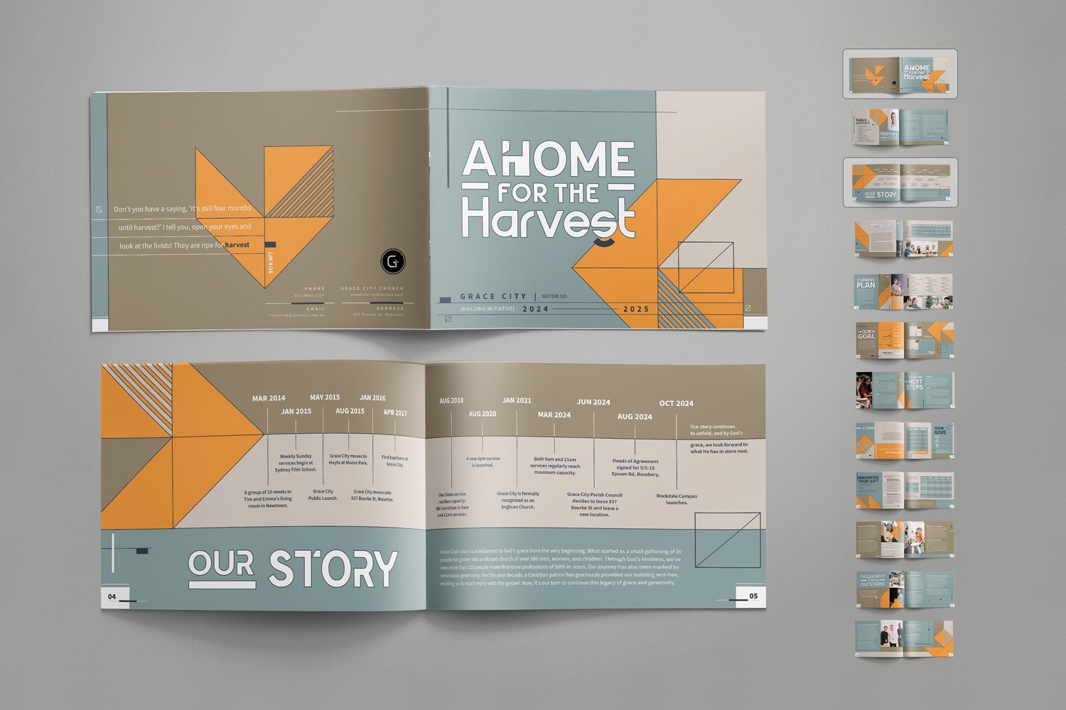
A Case Statement Booklet as a Campaign Cornerstone
Before a donor commits to a capital campaign, they must see the vision. The case statement booklet for Grace City helped make that vision tangible, outlining the church's history, the campaign's purpose, and the path forward. To ensure the booklet was engaging and easy to navigate, we designed a clean, structured layout that prioritized readability without sacrificing visual appeal. We rearranged the campaign's signature triangle motif to function as an arrow, subtly guiding readers' eyes from one section to the next. Color blocking organized content into clear, digestible sections, making it easy to follow the progression of the campaign's story.
Throughout the booklet, we incorporated small architectural details—overlapping lines appeared in borders or as creative motifs along the edges of pages. These elements tied back to the construction theme, reinforcing the idea of building a new home. Photographs were thoughtfully placed throughout, offering a personal connection by showcasing the people and communities who would benefit from the new space.
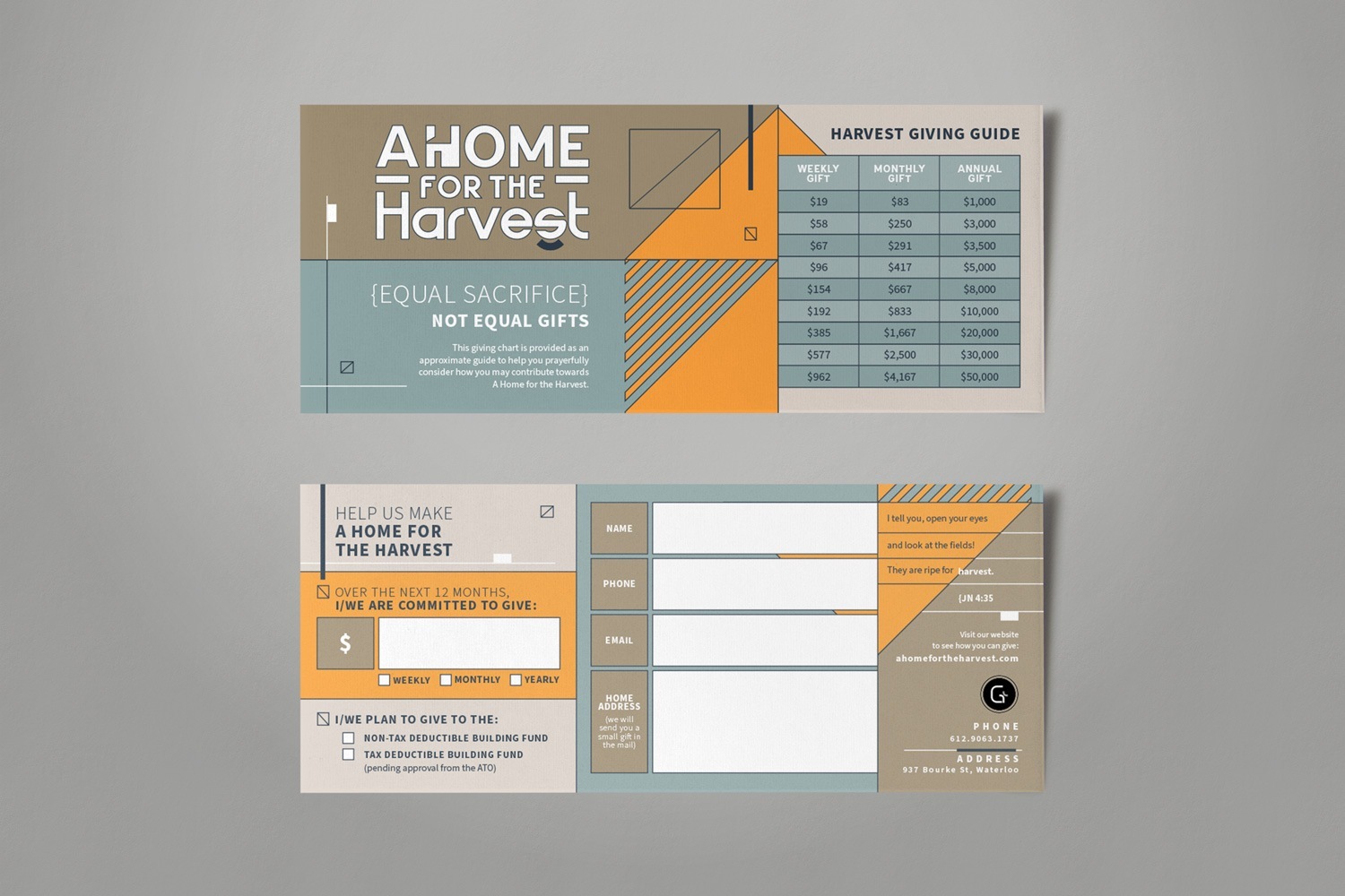
A Pledge Card To Help Break Ground for Support
A pledge card might be small, but it plays a significant role in a capital campaign. It gives donors a clear, simple way to commit their support, making the giving process more accessible. For Grace City's campaign, we designed a pledge card that was both functional and visually cohesive.
We kept the design intentionally minimal, using color blocking and structured text organization to make key details stand out. The campaign's signature orange triangle motif was overlapped with the giving guide and information boxes, naturally drawing attention to important sections. This approach brought energy to the design while keeping the pledge process seamless and inviting. We added outlined sections around the information boxes to reinforce the campaign's architectural theme, creating a structured, blueprint-inspired feel. These design choices tied back to the more prominent campaign aesthetic, ensuring that even this tiny but essential piece felt cohesive with the rest of the materials.
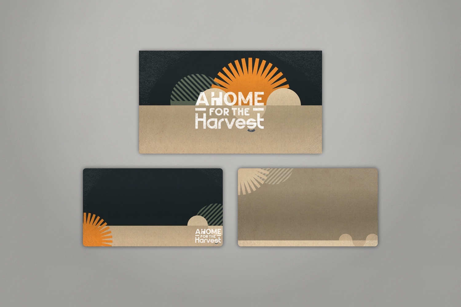
Add a New Layer of Reach with Digital Assets
Sunday services set the stage for a church-wide capital campaign, making visuals a key part of presenting the message. We created a series of sermon graphics for Grace City to support the launch of "A Home for the Harvest." These digital designs provided a backdrop for the campaign's goals, project timeline, and its spiritual significance, helping the congregation engage with the initiative meaningfully.
Because the church planned to use the graphics for both the campaign and a sermon series, we designed them to connect with the other materials and stand independently. Knowing they would appear on large screens during services, we focused on high contrast and visual clarity to ensure every message was easy to read from any seat in the room. We selected the darker tones from the campaign's color palette, using Licorice and light tan as the primary background colors, providing a strong contrast for key messages while keeping the design polished and cohesive.
To add depth and texture, we applied a subtle vignette gradient along the edges of each slide, mirroring the grainy texture found in Grace City's branding. We reimagined the architectural elements to align with the sermon series setting. The angular shapes transformed into a sun-like design, symbolizing growth and renewal, while sliced circles introduced movement and continuity, reflecting the church's ongoing work.
Our work with Grace City Church is just one example of how Abstract Union helps churches bring their capital campaigns to life through thoughtful, cohesive design. Another great example is our collaboration with The Way, a young, vibrant church in Elk City, OK: Future-Forward Church Capital Campaign Design for The Way. For their capital campaign, we created contemporary materials that reflected the church's dynamic energy and future-forward mission. While the designs utilized a neutral-toned color palette, they were anything but dull—strategic use of typography, layout, and subtle accents gave the materials a fresh, modern feel that resonated deeply with the congregation.
Grace City's capital campaign was about creating a space where the church could continue to grow, serve, and impact their community for generations to come. Abstract Union's design process focused on helping the church tell their story with clarity and purpose. By weaving architectural motifs, color blocking, and clean, modern typography throughout the materials, we created a design language that tied the campaign's message to the church's identity—reminding the congregation that this new building is more than added square footage. It's a place where expansion, connection, and faith can flourish.
If your church or nonprofit is preparing for a capital campaign, we'd love to collaborate with you. From logo development to print materials and digital assets, our team will partner with you to create custom, non-templated materials that capture your vision and inspire action.
