Seven Rivers Church in Lecanto, FL, is a thriving PCA congregation known for its warmth, spiritual depth, and commitment to meeting people where they are. The surrounding area has experienced significant population growth and increased membership in recent years. To continue expanding their reach through new ministry efforts, they launched a capital campaign. Having partnered with Abstract Union on their previous campaign, "Let Go," the Seven Rivers team understood the power of cohesive, story-driven design and the scale of effort it takes to do well. They decided to once again partner with Abstract Union, knowing that collaboration, creative strategy, and thoughtful execution would be essential to moving the campaign forward.
Seven Rivers chose "He Must Increase" as their campaign title. Based off of John 1:19 and 3:30 - "I am not the Christ...He must increase, by I must decrease" highlighted how church members could help the initiative by putting Christ at the center and allowing His reach to expand. Our creative direction for "He Must Increase" centered on clarity, familiarity, and forward movement. Every design choice was made to reflect the church's warm and approachable spirit while also giving the campaign a strong visual presence. Inspired by the Florida landscape, the color palette combined natural warmth with a modern edge. Two primary shades of green—one yellow-tinted and another with a grey tone—created a natural foundation, while soft white and light grey added calm and contrast. A greenish-yellow accent introduced energy and helped draw attention where needed. To deepen the campaign's geographic connection, we incorporated subtle geometric motifs inspired by the church's window panels. These created a familiar thread that grounded each piece in place and invited people into the story. For typography, we selected a single sans-serif font that struck the right balance between modern and approachable. Its clarity allowed for consistency across all materials, while reinforcing the campaign's clean, confident tone.
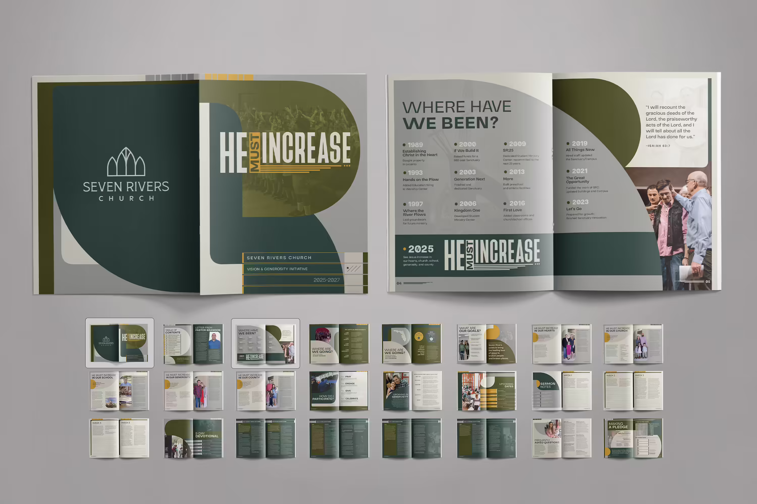
A Campaign Logo that Creates a Strong Starting Point
A campaign theme logo serves as the cornerstone of a capital campaign—setting the tone, giving the initiative a distinct visual voice, and anchoring it in both purpose and design. For Seven Rivers, we created a clean, bold sans-serif wordmark. The word "He," positioned on the left side, is made larger and taller to highlight His influence and reinforce the campaign's goal: to increase Jesus' presence so more people can experience His healing love. Beneath the word "increase," a series of ascending bars symbolize growth, movement, and momentum. Together, these elements form a subtle but clear expression of the campaign's intent—to expand, both spiritually and structurally.
Create Forward Momentum with Case Statement Items
In any capital campaign, case statement materials serve as the narrative backbone. They cast vision, establish trust, and show the tangible "why" behind the ask—carrying not only information but also momentum. For Seven Rivers, we developed two case statement pieces, each playing a vital role in introducing "He Must Increase" to a diverse and growing congregation.
The case statement booklet was designed to be immersive and personal—a material you could sit with, flip through, and connect to. Ideal for large presentations or mailing to families, the booklet is where the campaign initiative is laid out in full. Throughout the layout, we embedded organic shapes with rounded edges to create visual movement, organize content, and draw the eye to key moments. Inside these shapes, we placed photos of the congregation in action, grounding the campaign in the life of the church and highlighting the people already being impacted by its mission. We paid close attention to the typography and visual hierarchy in each spread, ensuring the booklet remained both visually engaging and highly accessible. Precise sectioning, intentional spacing, and rhythmic layout gave readers an intuitive path through the story—one that balances emotional resonance with clarity of information.
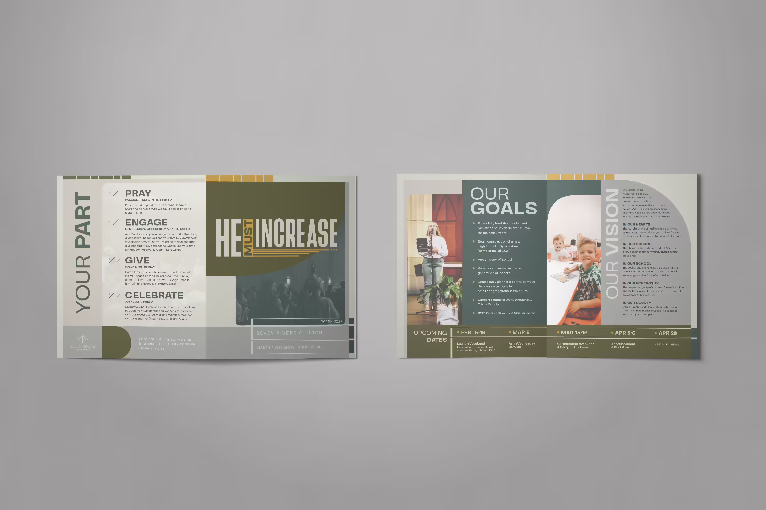
The case statement brochure served as a more compact expression of the campaign initiative—ideal as a takeaway for conversations with business owners, event attendees, or community members encountering the campaign for the first time. We distilled the core elements into a clear, approachable layout, giving readers a snapshot of the goals without overwhelming details. Visuals and messaging were carefully arranged to maintain flow, while organic shapes reappeared as color blockers—helping organize content, create rhythm, and prevent visual clutter across each page. The result was a high-impact handout that balanced form and function, making the campaign accessible and memorable across every setting.
A Pledge Card to Make Giving Plan Visible
Once donors have learned the details of the campaign goals and spent time praying about their role, they're ready to lay out their giving plan. The pledge card serves as the bridge between inspiration and action—helping members see how they can participate in turning the initiative into reality. For Seven Rivers, we designed a large-format pledge card that made space for not only practical form fields, but purpose-driven storytelling. A rendering of the new school gymnasium sits next to the Bible verse that inspired the campaign title, keeping the campaign goals front and center. We leaned into the green side of the color palette, using lighter tones to highlight key details and create boxed areas for entering giving plans. The information page itself is intentionally minimal—ensuring that every step felt simple, approachable, and easy to complete.

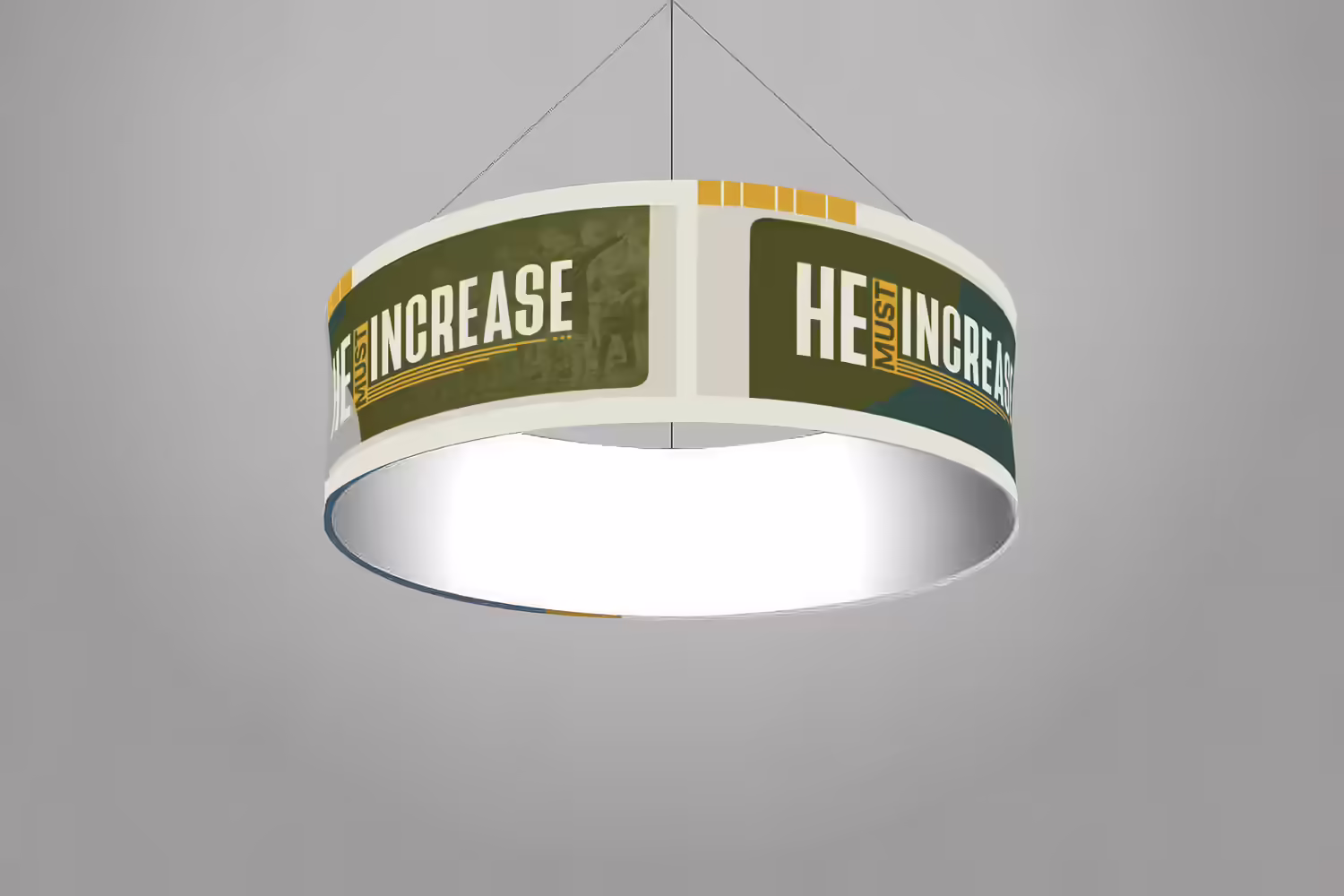
Keep the Campaign Present with a Hanging Banner
A capital campaign's success depends not only on printed materials but also on how the initiative is presented in the spaces where people gather. For Seven Rivers, we designed a circular hanging banner that brought "He Must Increase" into the physical environment, ensuring the campaign was visible, memorable, and part of the church's daily rhythm. Suspended from the ceiling, the banner was created to make an impact from a distance. We utilized bigger and bolder organic shapes and repeated the campaign logo around the surface to ensure legibility from all angles. Its elevated, floating presence helped carry the campaign goals above the noise. It served as a constant reminder of the church's collective calling and kept the initiative top of mind wherever it was displayed.
This project marked the second time we had the opportunity to partner with Seven Rivers Church. Returning to help shape "He Must Increase" felt like stepping back into a story already in motion. With clarity around their goals and trust already built, we were able to go deeper into design strategy and create campaign materials that not only communicated their vision but also felt rooted in their congregation and community.
This campaign united future vision with present identity. Every visual detail—from the Florida-inspired palette to the architectural motifs—was added to help members recognize themselves in the story and see how they could be part of what comes next. It's a reminder of why we do what we do: when design resonates, it doesn't just look good—it moves people.
Want to see where our collaboration with Seven Rivers began? Check out our blog post about the church's first capital campaign, "Let Go": Ministry-Boosting Church Generosity Campaign for SRC. We designed materials that were both striking and story-driven—laying the creative and strategic foundation for everything that followed.
Every capital campaign carries a unique story, and we believe the materials should reflect that. Whether you're launching a new initiative or looking to strengthen an existing one, we design campaign tools that feel purposeful, cohesive, and unmistakably yours.
