New Life Fellowship is a vibrant church community based in Arlington, TX, where people are passionate about loving God and each other. To strengthen their connections and grow their membership, they knew a brand refresh would be essential in reaching a younger audience. They wanted a look and feel that was personal, energetic, and truly inviting—one that matched the purpose and care that drives everything they do. With this vision in mind, New Life partnered with Abstract Union, and together, we set out to create a cohesive and inspiring brand identity.
Creating a cohesive brand identity for a church is no small feat. It means taking the time to understand the heart of the congregation and translating that into a visual story that truly connects with people. Every church community has its own unique character, and capturing that spirit visually is key. New Life wanted to make sure their brand reflected the same warmth, energy, and sense of purpose that their congregation brings to the community. To bring this vision to life, Abstract Union focused on designs that were both welcoming and meaningful, ensuring that every element would resonate with New Life’s values.
New Life Fellowship saw their brand refresh as a way to connect with a younger audience and strengthen the church’s sense of community, while staying true to their core values. Our shared goal was to create a visual identity that felt both inviting and meaningful—one that truly resonated with New Life’s members and newcomers alike. We began with a fresh color palette designed to capture the vibrancy and warmth of the congregation. Keeping Royal Blue from their original palette as a grounding color, we introduced Off-White and Sky Blue to bring a sense of calm and confidence, while Goldenrod Yellow added energy and a welcoming tone. The colors work together seamlessly to make each design feel uplifting and cohesive. We let the visuals tell the story, allowing the church's brand to speak through these thoughtfully chosen elements.
A Logo That Feels Timeless and Meaningful
Creating a brand logo that feels both modern and meaningful is key to establishing a memorable brand identity. For New Life, we designed a versatile, minimalist mark that subtly combines the letters “N” and “L”—a fresh take without traditional church symbols. We chose a bold sans serif font for the wordmark, bringing a sense of stability and confidence that reflects New Life’s dedication to its mission. Together with the color palette and design elements, this logo strikes the perfect balance between timeless and inviting, setting a warm tone for the entire brand.
Outreach Materials That Create Personal Connections
Outreach materials are a powerful tool for any church, often serving as a visitor’s first introduction to the community and brand. These materials create a welcoming bridge between the church and new faces, sparking connections that reflect New Life’s open, inviting spirit. To make this introduction memorable, we crafted outreach tools that truly embody the church's mission and values.
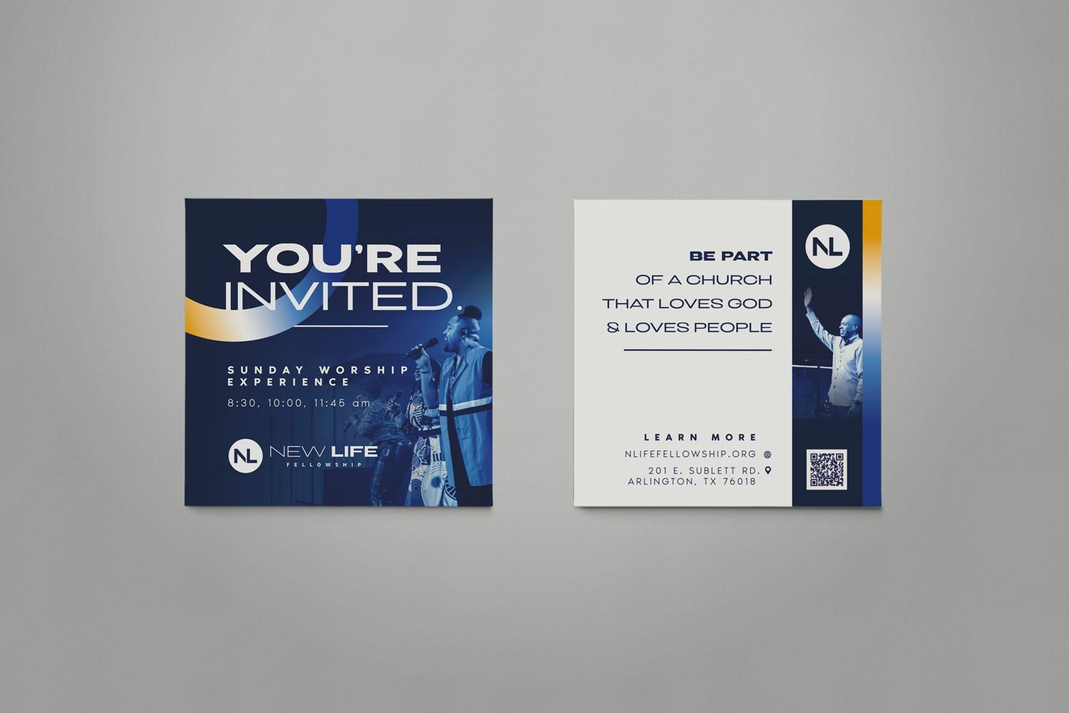
For New Life’s invite card, we chose a captivating photo of members singing as the background, bringing warmth and energy to the invitation. “You’re Invited” is prominently displayed at the top and stands out in a gradient circle, adding a heartfelt, personal touch. On the back, there’s a welcoming image of the pastor waving, as if greeting the recipient. With the Off-White background and the church’s motto in Royal Blue, the design reinforces New Life’s message of community and openness.
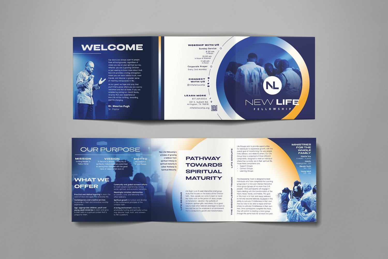
When guests visit a church, the amount of information can quickly become overwhelming. To help make that first impression feel welcoming and clear, we designed a brochure that combines New Life’s new brand style with accessible, functional layouts. The inside flap features a heartfelt message from the pastor, offering a warm and personal introduction. Inside, rounded shapes and thoughtful color blocking help organize key information—from ministries to service times—into easily digestible sections. On the back, contact information is displayed within a curved line element that mirrors the rounded forms throughout, gently guiding the reader’s eye. The result is a visually engaging, easy-to-navigate brochure that invites people into the life of the church with both clarity and care.
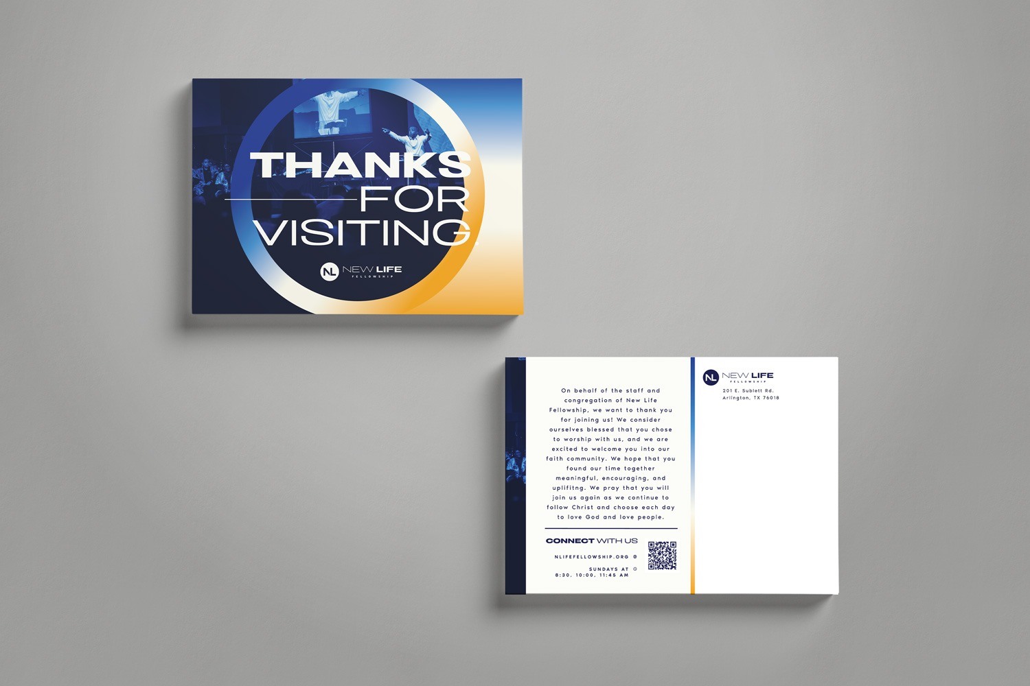
When someone new visits, it’s important to make them feel seen and appreciated. We created a postcard that expresses New Life’s gratitude and excitement for each visitor. On the front, a duo-toned image of the pastor with open hands sets a warm, welcoming tone, while “Thanks for Visiting” is centered to catch the eye. The back includes a thoughtful message, set against an Off-hite background, with New Life’s motto in Royal Blue and a gradient accent that adds a dynamic touch. These brand elements come together to make the design feel approachable, warm, and true to New Life’s identity.
In-House Materials for an Elevated Church Experience
In-house materials may only be seen within the church walls, but they’re some of the most used—giving members a chance to connect with the brand every week. We created materials for New Life that not only reflect the church’s brand but can also adapt to all kinds of church events, big or small.
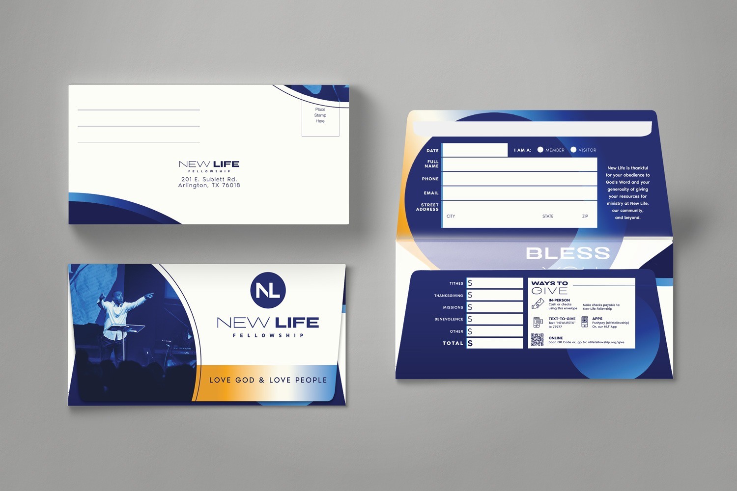
An offering envelope is a weekly opportunity for members to support the church they love and help it thrive. We designed the envelope to reflect the warmth and energy of New Life, recognizing that each contribution plays a part in the church’s mission. On the front, a duo-toned photo of the pastor delivering a sermon creates an immediate sense of connection. The words “Love God & Love People” stand out in the brand’s signature gradient of yellow, white, and blue, serving as a simple reminder of New Life’s core values and community spirit. Inside, Royal Blue highlights key areas where members can fill in their information, while subtle gradient circles in the background capture the excitement and purpose behind supporting the church.
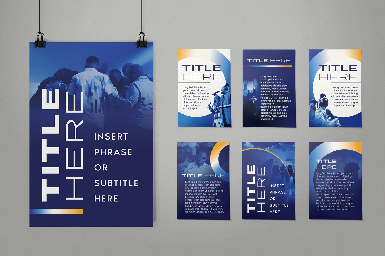
For church gatherings, whether ministry meetings, guest speakers, or special events, posters help create awareness and excitement. We designed a variety of poster templates that keep everything on-brand and engaging, reinforcing New Life’s identity throughout the church. Each design uses consistent title and subtitle fonts, duo-toned photos, and the familiar yellow-to-blue gradient. With templates that balance space for titles or more detailed information, New Life has adaptable and customizable options to suit any occasion while keeping their message unified and visually consistent.
Spread Your Message Far and Wide with Bold Signage
Signage plays a crucial role in reinforcing a church’s brand by creating a consistent and inviting experience—both inside and outside the building. Whether welcoming new visitors or strengthening connections with current members, banners and other signage communicate the church’s identity, values, and mission at a glance. Each banner was thoughtfully designed to reflect New Life’s bold and bright spirit in every detail.
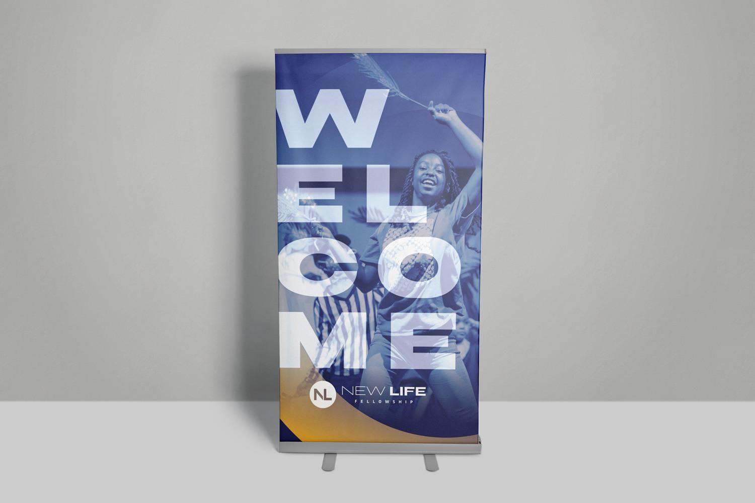
The retractable banner is a versatile tool that can be moved and placed wherever needed, offering a heartfelt greeting to new visitors and long-time members alike. The word "WELCOME" is prominently displayed in the church’s primary brand font, stacked vertically to create an eye-catching presence that welcomes and engages every visitor. On the right side, a smiling face adds a warm, personal touch. A bold yellow gradient at the bottom connects seamlessly with the church’s logo, reinforcing brand recognition and creating a cohesive look.
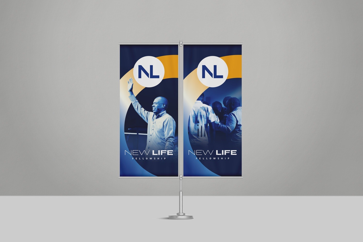
While the retractable banner offers a flexible indoor solution, we also extended New Life’s branding beyond the building with pole banners. These outdoor banners celebrate the church community by featuring vibrant imagery of members in action, complemented by the brand’s signature blue and yellow gradients. The church’s logo is positioned in the top-center in a high-contrast style, ensuring visibility even from a distance. These banners not only enhance the church’s exterior but also serve as a visual reminder of its strong sense of fellowship and inclusivity.
Together, these banners work to create a welcoming environment that strengthens New Life’s brand and community presence.
Expanding Digital Reach with Social Media Assets
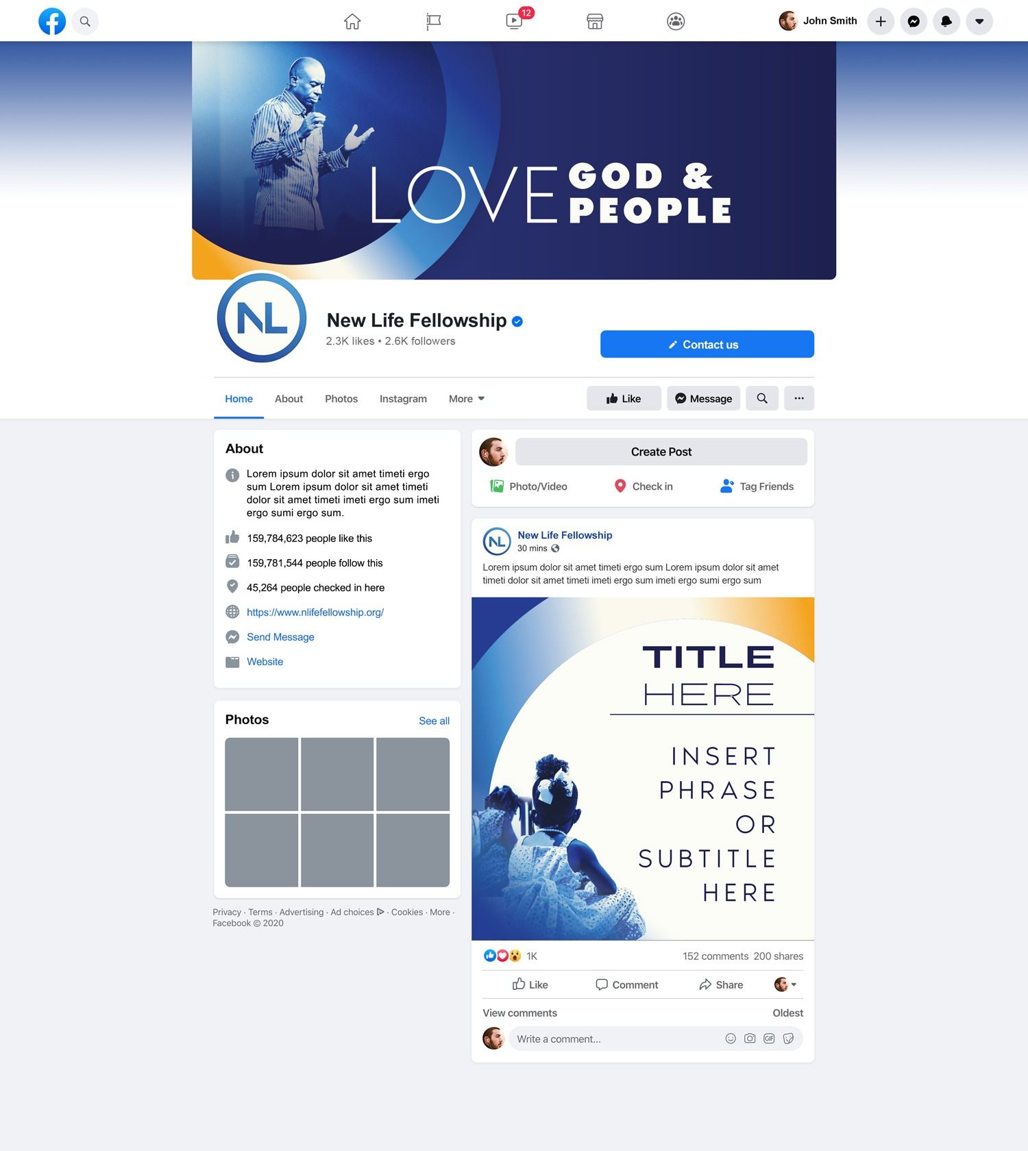
With so many people connecting online, New Life wanted a social media presence that would reflect their welcoming brand and help them connect with people in a more modern way. Staying current and cohesive across digital platforms was key, so we created a custom social media pack with a profile picture, cover photo, and post templates for Facebook. Each piece was designed to highlight New Life’s brand identity and make their page feel both polished and inviting.
The cover photo is often the first thing people see, so we used New Life’s color palette to make a strong impression. A duo-toned photo of the pastor, framed by a gradient circle, is positioned on the left, with head lowered and hands speaking, a nod to the church’s motto in the center. The Royal Blue background brings depth, helping all the elements stand out.
For the profile picture, we used both of the brand’s blues to create contrast, ensuring the logo is visible and recognizable against Facebook’s mostly white layout. A gradient in the logo aligns it with the brand’s identity and adds visual interest to keep the look dynamic.
The post templates were designed with plenty of space for titles and subtitles, making it easy to share information clearly. The Off-White background makes reading comfortable, while the duo-toned photos and gradient circle help each post feel like a cohesive part of New Life’s brand—eye-catching in the feed and instantly recognizable.
Looking for other church branding inspiration? Check out our partnership with Liberate Church: Church Branding Ideas: Logo Design, Style Guide, & Strategy for LC. They wanted branding that better reflected their culture of being a safe place where people can heal. We created a brand with a vibrant and soothing look, using sans serif typography and layouts that were both functional and striking.
Working with New Life to refresh their brand and bring their energy and purpose into every design was truly rewarding for us. By combining modern aesthetics with intentional design, we’ve created a look that feels true to New Life’s mission and warmly invites people into their community. If your church or organization is ready for a brand refresh that tells your story, we’d love to partner with you to make it happen. Let’s work together to bring your brand vision to life!