In Charlotte, NC, Friendship Missionary Baptist Church welcomes all people into a community built on worship, service, and shared faith. With a heart for ministry both locally and globally, the church invites individuals from all walks of life to come together in prayer, fellowship, and the study of God's word. As Friendship looked toward the future, its leadership recognized a growing need to enhance the worship experience for its congregation. They launched a capital campaign to secure support for removing visual obstructions, addressing long-standing sound challenges, installing advanced audio technology, and add LED monitors to display graphics during services.
Early in the process, church leaders began developing materials to communicate the initiative. But as the vision expanded and the importance of a cohesive presentation became more apparent, they realized they needed something more: a creative partner who could help tell their story with the care, clarity, and professionalism it deserved and ensure their vision resonated deeply with every member of their congregation. That's when they decided to partner with Abstract Union.
We combined classic church aesthetics with a modern visual approach for Friendship's campaign materials, reflecting both the renovation goals and the congregation's spirit. Inspired by the sanctuary's stained-glass windows, we developed a jewel-toned color palette and an angular design motif that carried across all touchpoints. For typography, we paired a clean sans-serif with a refined serif to strike a balance between clarity and elegance. This combination gave every material a polished, contemporary feel, resonating with long-standing members, new families, and potential community supporters alike.
Anchor Campaign Design with a Logo
From the start, Friendship wanted a campaign theme logo that felt connected to the heart of their initiative and their congregation. We refined their original idea into a polished, versatile mark inspired by the beauty of sunrises. Geometric rays extend upward and outward, symbolizing momentum and vision for the future. We paired classic and modern typography to add balance and elegance. Together, these elements represented clarity, hope, and spiritual renewal, mirroring the campaign's efforts to create a more open and engaging worship experience.
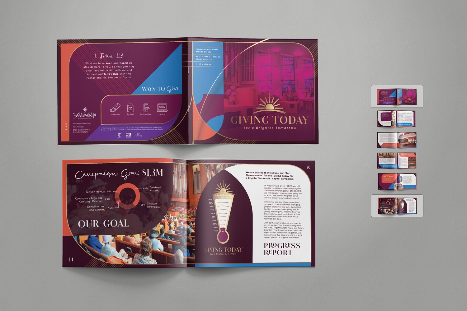
A Booklet & Brochure to Make Your Case Statement Crystal Clear
A case statement is one of the most essential tools in a capital campaign. It communicates not just what needs to be funded, but why it matters—spiritually, practically, and communally. It invites people into the story of the campaign and provides them with a clear and meaningful way to participate.
For Friendship, we designed a case statement booklet that guided readers through each page using a thoughtful mix of angular and rounded shapes. These elements helped organize key information while adding visual interest and motion. Gold lines traced these shapes and extended into diagonal motifs along the edges, adding a subtle sense of movement and refinement. We used clear and consistent text styling to make the content easy to follow, ensuring the booklet was both functional and visually striking. We also included photographs and renderings to highlight the people whom the campaign would impact and to illustrate the exciting changes that could be possible.
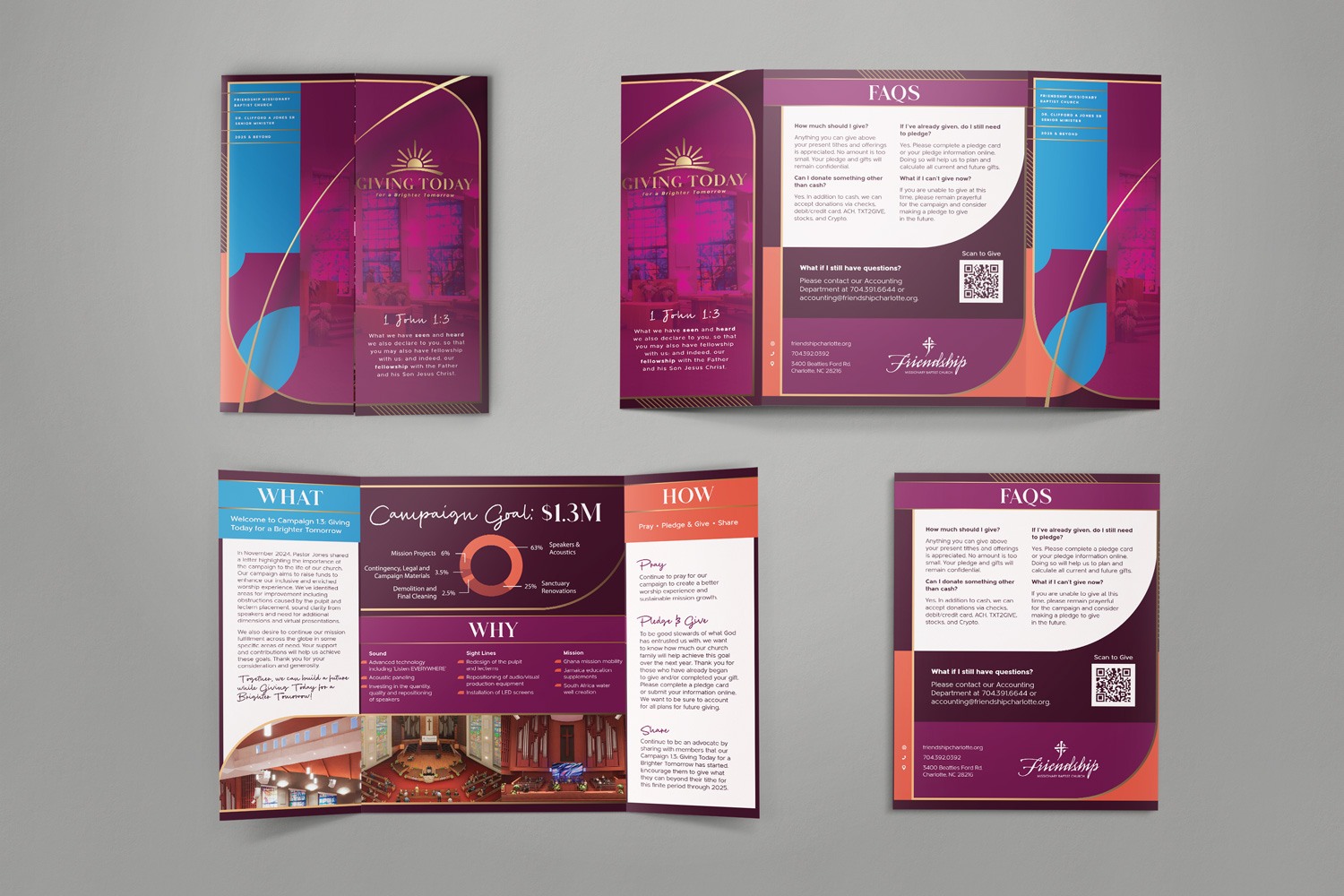
While the booklet provided depth, the case statement brochure was designed for simplicity and ease of distribution. We distilled the core elements into a compact format that could be handed out during services, shared at welcome tables, or sent home with prospective supporters. To make the brochure as engaging as possible, we used color blocking from the jewel-toned palette and overlapping shapes to enhance readability and draw attention to key content. The result was a condensed case statement that quickly captured interest, clearly communicated the campaign's purpose, and left readers wanting to learn more.
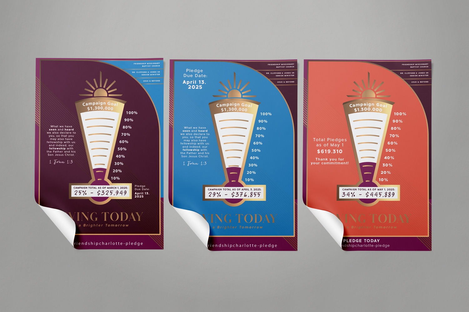
Keep the Momentum Going with a Poster
While knowing you're contributing to something meaningful is a powerful motivator, it's more encouraging to see that progress visually. To help build momentum and keep the vision front and center, we created a series of posters that tracked the campaign's progress toward its goal. The design featured a thermometer graphic with the top angling upward and outward, echoing the forward motion of the campaign. We layered a shape underneath to frame the thermometer and help the details stand out. To make giving as easy as possible, we included a QR code that allows viewers to scan and contribute directly to Friendship's initiative. Displayed in key gathering areas, these posters served as a visible reminder of the community's prosperity and shared commitment to the cause.
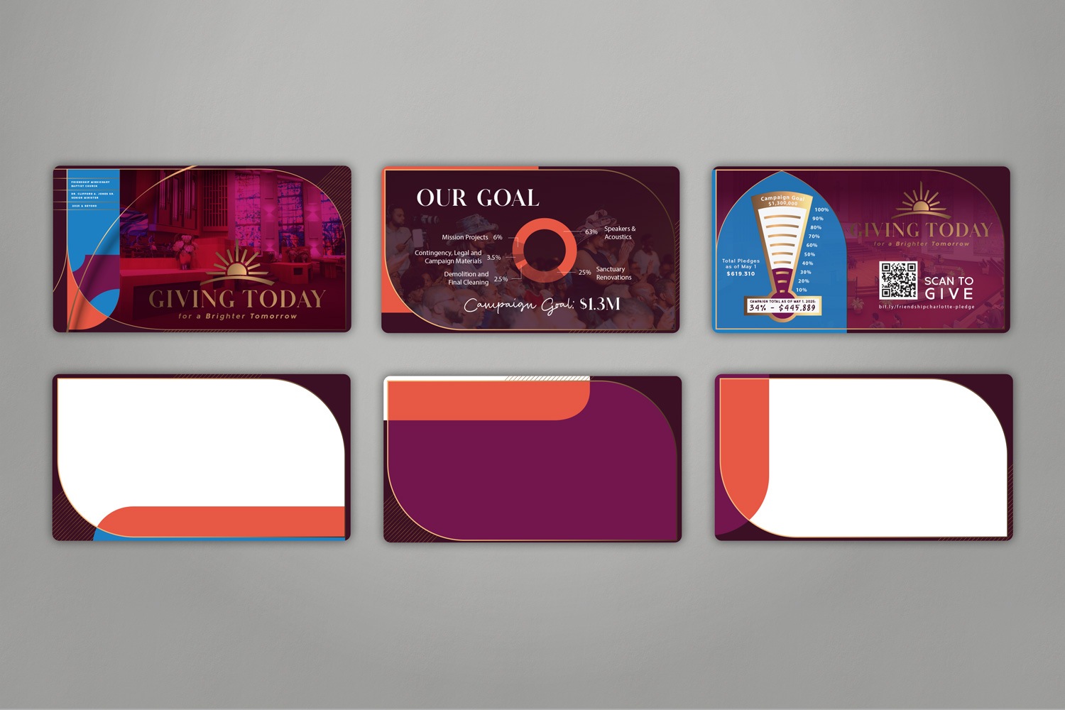
A Slide Deck to Present Your Campaign Anywhere
Sharing information about a capital campaign often happens beyond the church walls—during meetings with potential donors, small group gatherings, or leadership presentations. To ensure the campaign could be presented clearly and confidently in any setting, we created a custom slide deck. We adjusted the case statement elements for on-screen readability, resizing text and visuals to remain crisp and accessible across devices. The design remained intentionally minimal, allowing room for key messages, speaker notes, and visual aids without distraction. Gold lines threaded throughout the deck added cohesion, quietly reinforcing the campaign's visual identity and creating a sense of continuity from slide to slide.
A capital campaign is about more than just raising funds - it's developing a goal, building unity, and inviting people into a shared future. Friendship's campaign showed how intentional materials, when grounded in a church's unique voice, can help carry an initiative forward with clarity and confidence. Each piece served a specific function, but they were most powerful when working together. They formed a consistent visual dialogue that helped the congregation see progress, feel connected, and participate in something bigger than any single moment. At Abstract Union, we believe design should do more than decorate; it should support, amplify, and reflect the people it's for. Helping Friendship share their campaign goals was an honor, and a reminder that design can be just as effective as a sermon, a handshake, or a song.
If you're interested in how campaign materials can strike a unique tone while honoring tradition, take a look at our blog post on Graceway: Blending Tradition with Modernity in Graceway’s Capital Campaign. We paired modern design with architectural details from their historic space to support a dynamic, growing congregation as they prepared to build a new facility.
If your church is preparing for a capital campaign, we'd love to help you bring your initiative to life. At Abstract Union, we specialize in creating custom materials that reflect your congregation's voice, values, and vision for the future. Whether you're beginning or looking to elevate what you've already started, reach out to start a conversation about how we can support your next chapter.
