For over 50 years, Commissioned International, based in Hattiesburg, MS, has faithfully lived out a straightforward yet profound mission: to evangelize the lost, disciple the saved, and minister to the needs of the poor. Founded in 1974 as Baptist Medical and Dental Mission International (BMDMI), the organization started by bringing essential healthcare and the gospel to underserved communities. While its methods have evolved, that founding purpose remains central to its work today. From those early medical missions, Commissioned Intl. has grown into a multi-faceted ministry serving communities across Honduras, Nicaragua, Guatemala, and Nepal. Its decades of dedication have led to a lasting impact through medical clinics, children's homes, schools, and leadership development initiatives.
After decades of ministry and global growth, Commissioned Intl. found itself at a crucial crossroads. With a new name and visual identity recently established, they launched a nonprofit capital campaign to carry that momentum forward, "The Commissioned Initiative." They wanted the materials to feel like a natural extension of their brand, while still conveying a fresh initiative with its own sense of movement and purpose.
Their audience was broad and deeply invested: longtime supporters, Baptist congregations, mission-minded families, and business owners who had faithfully given for years. They needed cohesive and contemporary campaign materials that honored their past and cast a compelling vision of what could be next. Recognizing the scope and significance of the task, they partnered with Abstract Union to bring that vision to life through purposeful design and strategy.
From the start, Abstract Union and Commissioned Intl. shared a clear goal: to create a capital campaign experience that felt purposeful, inviting, and rooted in the story. We knew the materials needed to resonate with supporters across generations, clearly communicate the campaign goals, and reflect the trust and credibility the organization has earned over the decades.
The design had to feel like a seamless extension of the brand but stand on its own as a separate initiative. We built on the nonprofit's established identity by using their primary blue and yellow brand colors, softening the palette with off-whites to preserve clarity without visual tension, resulting in a tone that felt confident, warm, and grounded.
We were equally intentional in our use of typography, pairing a timeless serif font with a clean, modern sans serif to strike a balance between tradition and accessibility. Layouts were structured and open, designed to support photography that put real people and ministry moments front and center. Every design choice was made to create a sense of movement, clarity, and connection.
A Logo Symbolizing Direction & Purpose
Every capital campaign needs a clear sense of direction—something that keeps the initiative focused, unifies materials, and signals purpose to donors at every touchpoint. A campaign theme logo plays a key role in providing that direction. It becomes a symbol that grounds the campaign and connects every piece of communication back to its core goals.
For "The Commissioned Initiative", we created a logo that felt distinct and deeply connected to the organization's brand. We drew inspiration from the organization's primary logo, integrating rounded edges and structured diagonals to create a subtle compass. This polished motif served as a visual metaphor for the organization's mission: to go intentionally, meet people where they are, and advance the gospel globally. To further connect the logo with the campaign's broader visual system, we incorporated both font types—serif and sans serif—striking a balance that highlighted the campaign's goals while reinforcing the brand's tone of clarity and conviction.
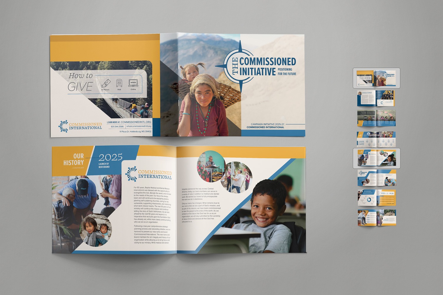
Tell Your Story & Build Trust with a One-Pager & Booklet
Every campaign has a story—one that includes not just an organization's history, but the turning point that brought them to this moment and the reason a capital campaign is needed. Communicating that story well requires a format that offers both structure and space. For Commissioned Intl., we created two key storytelling tools — a one-pager and a case statement booklet — each designed to communicate the campaign's purpose, priorities, and potential impact with clarity and conviction.
The one-pager offered a concise snapshot of the campaign story. Designed for quick engagement—whether handed out at events, mailed, or shared digitally—this material focuses on the campaign's purpose and key objectives. We designed the one-pager to spark an emotional connection and provide a clear summary of the campaign's goals—leaving the reader intrigued and eager to learn more. Beautiful photos carried the story forward, while color blocking, diagonal shapes, and a clear text hierarchy ensured that every detail was understood.
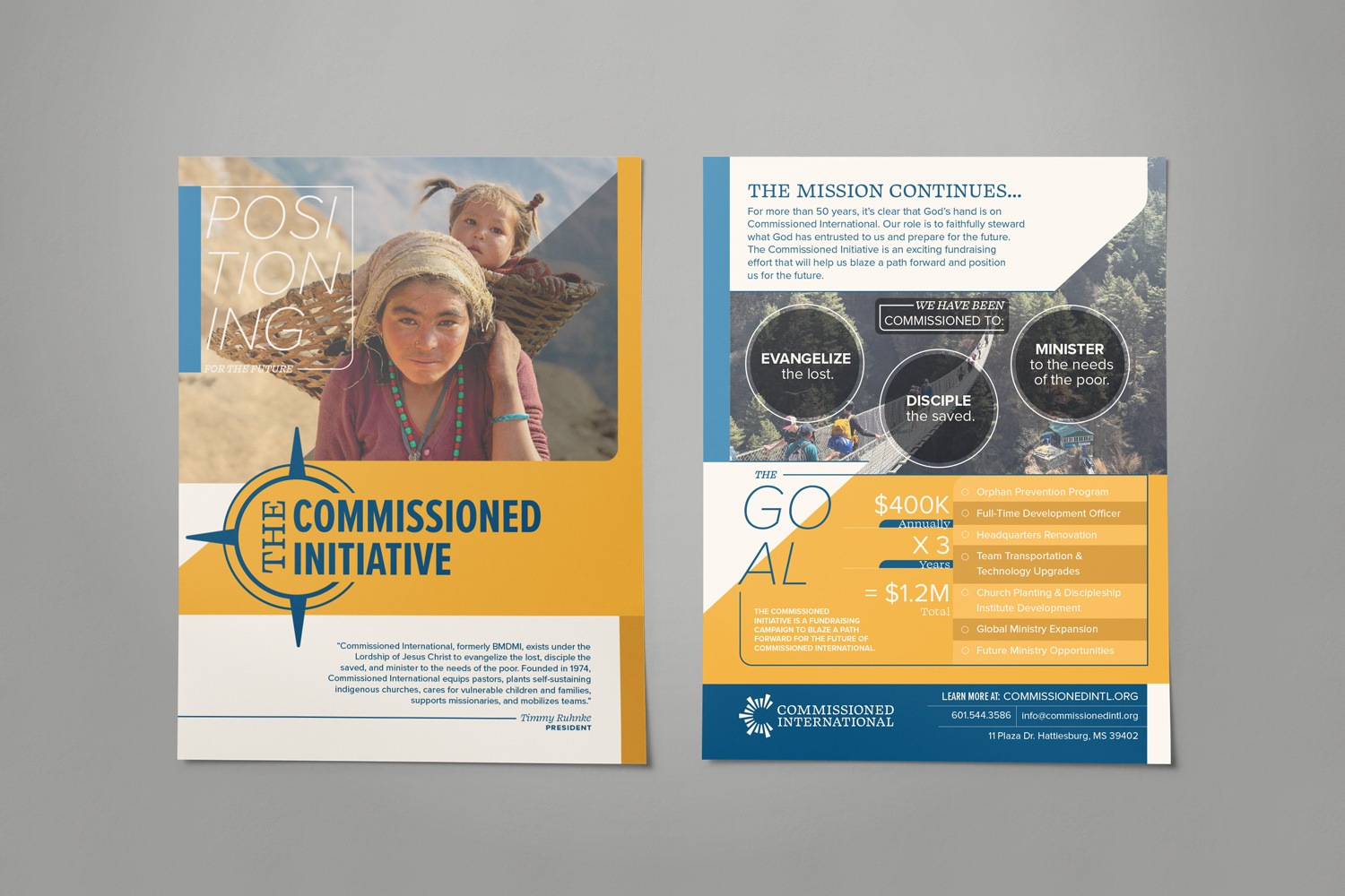
The case statement booklet expanded on the story introduced in the one-pager, walking the readers through the legacy of Commissioned Intl., the current needs prompting the campaign, and the tangible outcomes that giving would support. We approached the layout with a sense of narrative flow, using diagonal lines with rounded edges to zig-zag across each spread and gently guide the reader's eye from one section to the next. Photography was woven throughout, with select images breaking out of their shapes to create a feeling of closeness and presence. Important details were given space to breathe, allowing each piece of information to sink in. Color was used intentionally to keep points organized and engaging. The booklet created space for trust and clarity to grow. It gave readers more than just information; it gave vision and invited them to see their role in something enduring and meaningful.
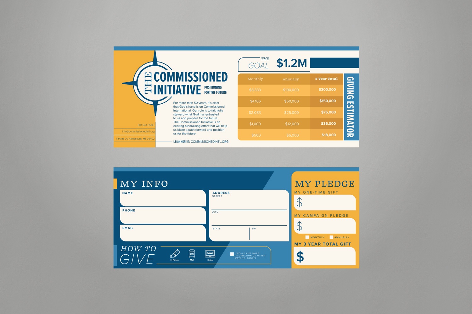
A Supporter-Centered Call to Action in a Pledge Card
With the foundation laid through the case statement items, the pledge card turned inspiration into action. This small but essential piece was designed to make the giving process feel approachable, clear, and intentional. We used a clean, strategically minimal layout that left space only for essentials: key giving options, clear next steps, and places for donors to include personal information. Brand colors were utilized to add contrast, supporting visual hierarchy and readability. Every element was designed to feel helpful, not overwhelming, ensuring that donors could confidently give in the way that worked best for them or request more information with ease. The pledge card played a pivotal role. It was the moment where supporters could say "yes"—not just to giving, but to joining a shared vision for lasting ministry impact.
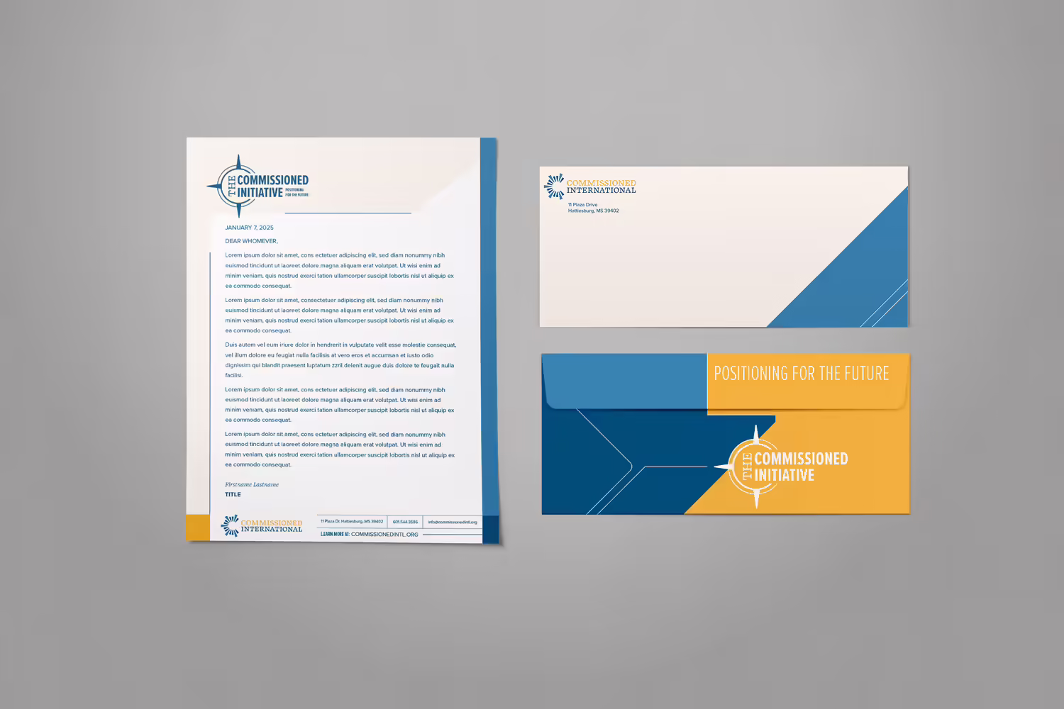
A Letterhead & Envelope for Cohesive Correspondence
Effective communication is essential to any capital campaign. Whether used for mailed appeals, campaign updates, or donor acknowledgements, the correspondence needed to reflect its importance. We custom-designed a letterhead and envelope set for Commissioned Intl., ensuring visual consistency for every written interaction.
A No. 10 universal size envelope carried the campaign's design language boldly. A diagonal shape and angled lines in the front corner invited curiosity and subtly encouraged recipients to turn the envelope over. On the back, the lines converged at the center, drawing the eye to the campaign logo and serving as a visual reminder of the initiative's purpose before the letter was even opened.
For the letterhead, we kept the details subtle but impactful. Thin blue and yellow shapes framed the page, adding decorative structure without distracting from the content. The main writing area was set on a clean white background to ensure easy readability. Essential contact information and the campaign logo were placed at the top and bottom of the page, creating instant recognition and reinforcing the connection to "The Commissioned Initiative" with every message sent.
"The Commissioned Initiative" wasn't just a fundraising effort — it was a turning point for a ministry with a 50-year legacy and bold vision for what's next. We crafted every element to tell a cohesive story, build trust with supporters, and invite meaningful participation. By pairing storytelling with brand consistency, we helped Commissioned International share its campaign in a way that honored its past and energized its future. It's a reminder that thoughtful design is more than visuals; it's about giving people a reason to lean in, engage, and say yes to something bigger than themselves.
Looking for another example of how thoughtful design can bring a capital campaign to life? Check out our collaboration with Bridge of Hope: Bright & Bold Nonprofit Capital Campaign for Bridge of Hope. This nonprofit supports single mothers and their children through housing, mentorship, and the development of life skills. We created a modern, energetic campaign that stayed true to the organization's brand while amplifying its goals with clarity and heart.
At Abstract Union, we specialize in creating cohesive capital campaign materials that reflect the voice and the future goals of the organizations we serve. We know how much time, energy, and heart nonprofits pour into their work — our role is to streamline the creative process so they can stay focused on what matters most. From storytelling and design elements to practical, on-brand deliverables, we bring clarity, consistency, and care to every piece we create.
If you're launching your capital campaign and need a partner to help shape your message and materials, please reach out. We'd be honored to help you bring your vision to life.
