Grace Fellowship Covenant Church in Orland, IL, is stepping into a transformative new chapter. With a mission to deepen faith through scripture, prayer, outreach, and fellowship, this welcoming church has become a thriving spiritual home for its community. With rapid growth in recent years, they are making changes to better serve their congregation, including adopting a new name and looking for a permanent location. To mark this new chapter, Grace Fellowship sought a fresh, modern brand identity that reflected their welcoming spirit and forward-thinking vision. They partnered with Abstract Union to develop a cohesive logo and identity system designed to inspire connection and create a lasting impression within their community
Currently lacking a permanent space, the church’s vision and mission became the cornerstone of our design inspiration. Grace Fellowship desired a brand that mirrored the vibrancy and joy of their congregation. We began with a cream color to lay a neutral foundation and infused rich and dynamic hues - blue-purple and light turquoise to add brightness and calm. paired with accents of sage green and yellow-orange to bring everything to life. Accents of sage green and yellow-orange were added to bring vitality and energy, ensuring the brand stayed visually engaging across all materials.
A Logo to Set a Brand Foundation
For the new brand logo, we decided to forgo church symbols and instead developed a mark that was lifestyle brand-ready. The logo’s two overlapping squares subtly form arrows, representing the church’s emphasis on fellowship and connection. At the center, we abstracted the letter "G" in a way that also suggests "G" and "F," incorporating the church's initials without the need for a lengthy acronym. This modern and versatile logo positions Grace Fellowship as a forward-thinking church while honoring their sense of togetherness.
Currently lacking a permanent space, the church’s vision and mission became the cornerstone of our design inspiration. Grace Fellowship desired a brand that mirrored the vibrancy and joy of their congregation. We began with a cream color to lay a neutral foundation and infused rich and dynamic hues - blue-purple and light turquoise to add brightness and calm. paired with accents of sage green and yellow-orange to bring everything to life. Accents of sage green and yellow-orange were added to bring vitality and energy, ensuring the brand stayed visually engaging across all materials.

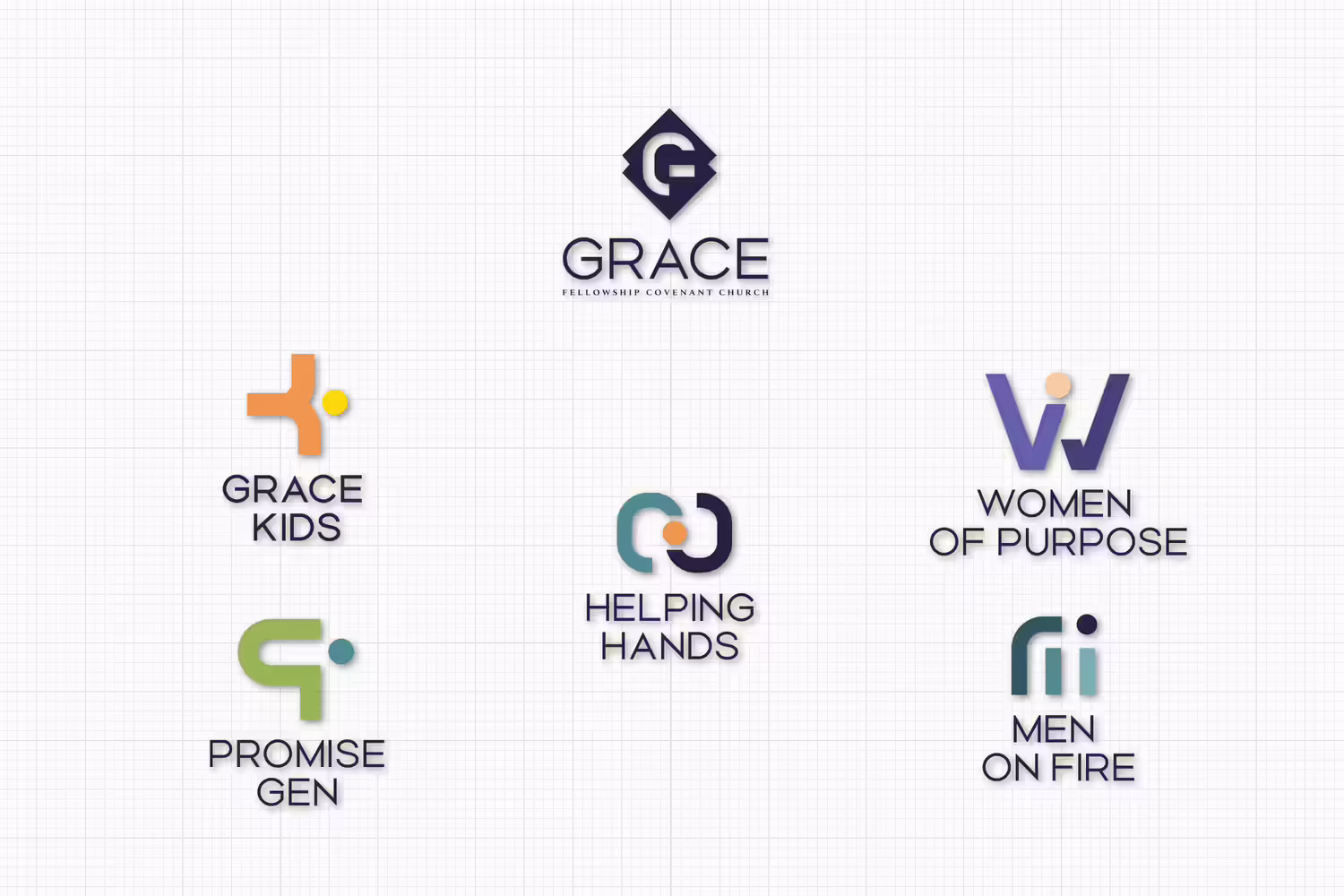
Sub-Ministry Marks Showcase Unique Identities Within the Whole
In addition to the main Grace Fellowship Covenant Church identity, we created a family of sub-ministry marks that give each group a distinct voice while staying connected to the larger brand system. Each logo uses shared geometry, clean typography, rounded forms, and purposeful color to keep the ministries visually unified.
For Grace Kids and Promise Gen, brighter palette tones and abstract letterforms create a playful, energetic feel for children and youth. Women of Purpose uses a stylized “W” that suggests arms lifted upward, reflecting encouragement, empowerment, and support. Men on Fire takes a stronger, more grounded approach, with a simplified “M” that communicates unity, conviction, and men standing together in faith. Helping Hands uses interlocking shapes and a central circle to represent connection between those in need and those ready to serve. Together, the marks create a flexible brand family that helps each ministry feel recognizable, meaningful, and connected to Grace’s larger identity.
Outreach Materials that Leave an Impression
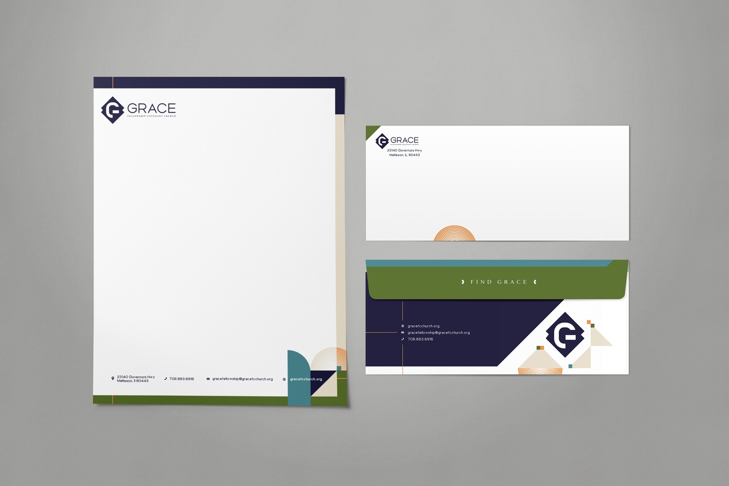
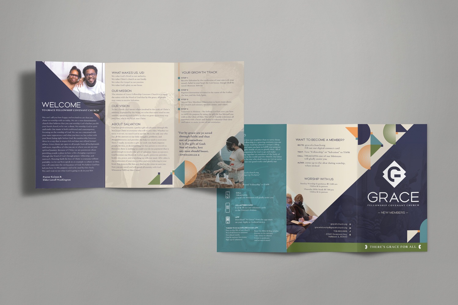
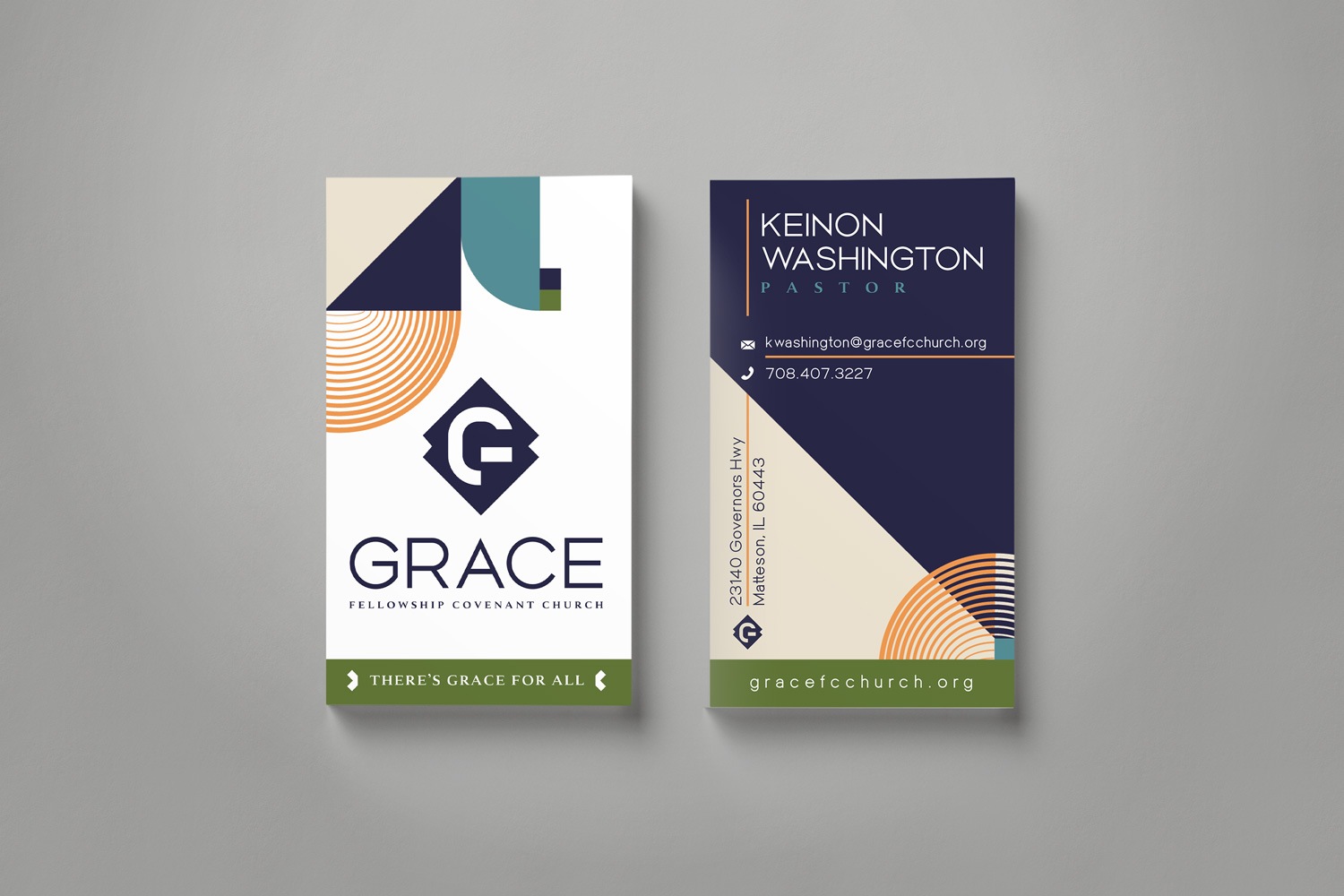
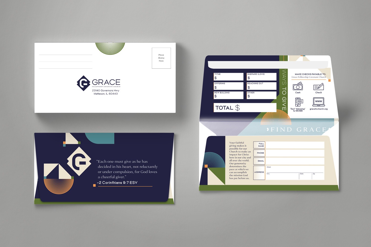
To help Grace Fellowship connect more deeply with its members and community, we created outreach and communication materials that are both functional and eye-catching. The custom letterhead and No. 10 envelope incorporate geometric shapes from the church’s branding, with a thin, colorful border adding a touch of elegance. The front of the envelope keeps things clean and simple, with the logo as the focal point and rounded lines guiding recipients to explore the back. On the reverse side, bold geometric motifs immerse recipients in the church’s new identity, creating a polished and memorable experience. A trifold brochure provides ample space to share the church's values and vision. We used a combination of color blocking and geometric shapes across the entire brochure. The contrast between light and dark colors from the brand palette helps highlight key points, while abstracted triangles draw attention to important sections. For the business cards, bold yellow-orange lines draw the eye to essential contact information; the person’s name and title were added on the top section in a larger size to make them easily seen. The front of the card features a motif of triangles, lines, and other geometric shapes coming together to create a larger and vibrant design, echoing the church’s focus on connection and fellowship. These details on each of these materials ensure a lasting impression on anyone who receives them. They will be utilized across both digital and print formats, helping Grace Fellowship communicate effectively and expand its reach.
In-House Materials Enhancing the Church Experience
The in-house materials we created for Grace Fellowship are essential to their branding, enhancing the experience for everyone who walks through their doors. These materials immerse members in the church’s identity and foster a strong sense of connection and belonging.
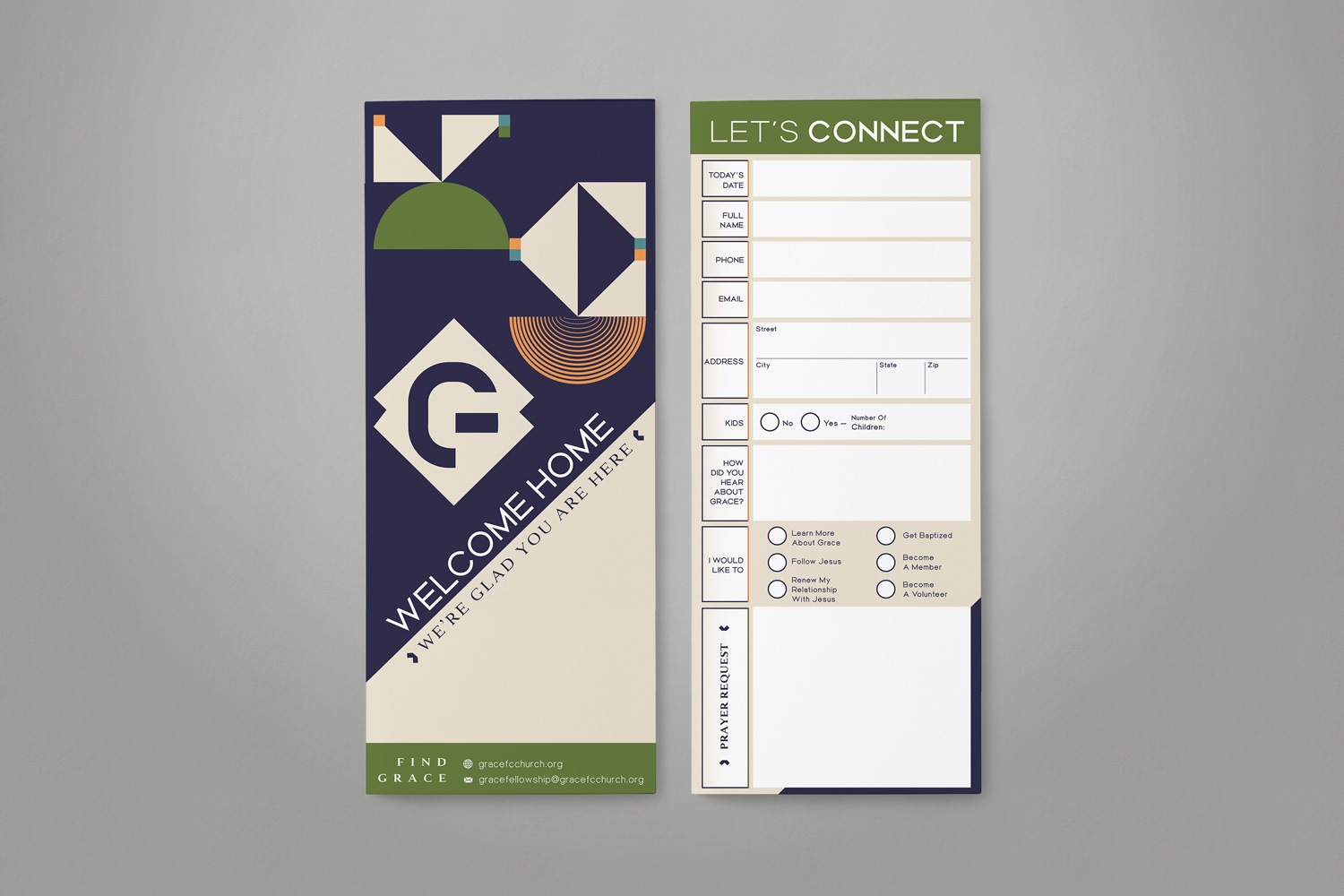
The connect card helps new members feel welcomed and opens the door for future fellowship. Its vibrant pattern of triangles and squares comes from the church’s brand motif, symbolizing the many ways fellowship connects people. On the back, we included space for important information, making the card as practical as it is inviting.
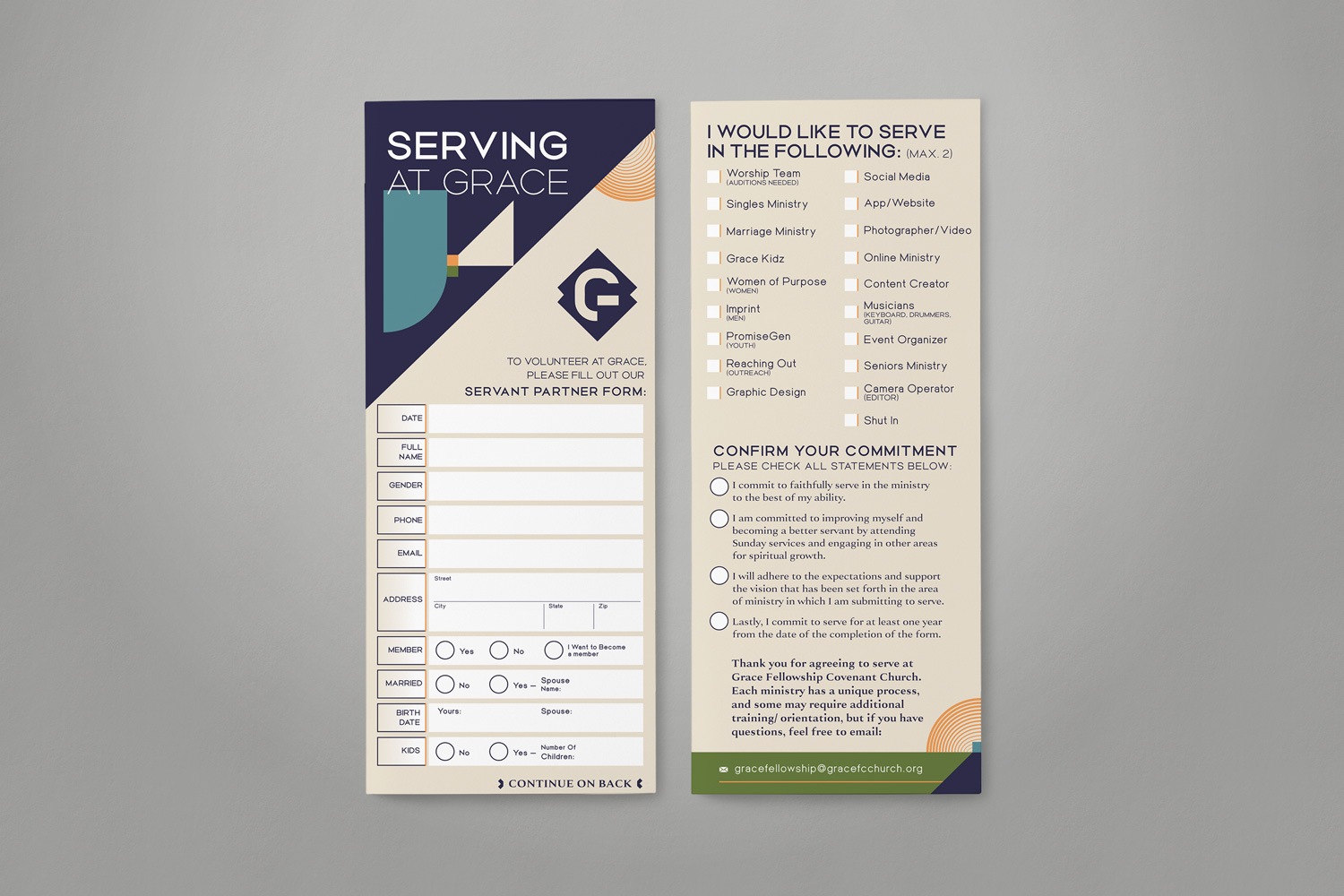
The volunteer card is a vital resource for members eager to support the church’s mission but unsure where to begin. It provides a list of various volunteer opportunities, helping members identify where their talents and passions can be utilized. We kept the design thoughtfully minimal by placing the motif along the edges, ensuring ample space for information and clear visibility of all volunteer options.
The offering envelope is a simple yet meaningful tool for members to support Grace Fellowship’s mission. We designed it with a blue-purple backdrop to create a striking contrast, capturing the excitement of giving while ensuring the layout is clear and easy to use. Space for personal information and giving details ensures it’s both practical and thoughtfully designed.
Wayfinding Signage that Guides with Purpose
Wayfinding signage plays an integral role in tying the elements of a church’s brand together. These signs can be placed both inside and outside a building and give opportunities for continual brand reinforcement every time they are seen. Beyond branding, wayfinding signage serves a functional purpose, helping members and visitors navigate the space with ease.
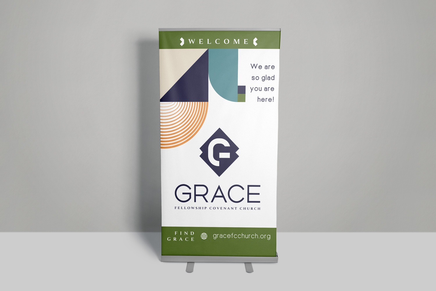
To support Grace Fellowship’s evolving needs and mobile presence, we created a retractable banner that delivers both visual impact and practical function. This large yet portable piece offers a bold introduction to the church and its brand at worship gatherings, outreach events, and community booths. Key details were made large and easy to read, ensuring visibility even from a distance. Signature triangle and rounded shape motifs appear in the top left corner, subtly reinforcing the brand without overwhelming the design. Set against a clean white backdrop, the banner strikes a modern, welcoming tone—reflecting the warmth and joy at the heart of the church.
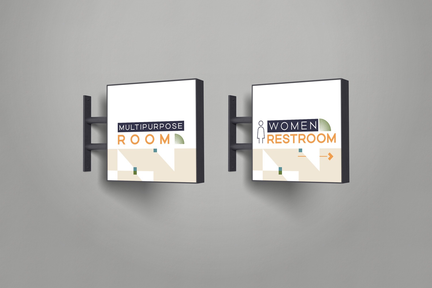
As Grace Fellowship continues its search for a permanent home, we designed acrylic signs that is both portable and durable, ensuring it can adapt to future locations. The signs feature the church’s motif of triangles and connecting squares, creating a dynamic design that reflects the brand’s focus on unity and connection. Each area title is styled with the primary brand font for consistency. To create contrast, the top words on each sign are framed in the church’s signature blue-purple, while the bottom words pop in bold yellow-orange. Universal symbols were also added for high-traffic areas like bathrooms and the cry room, helping visitors find their way quickly and easily.
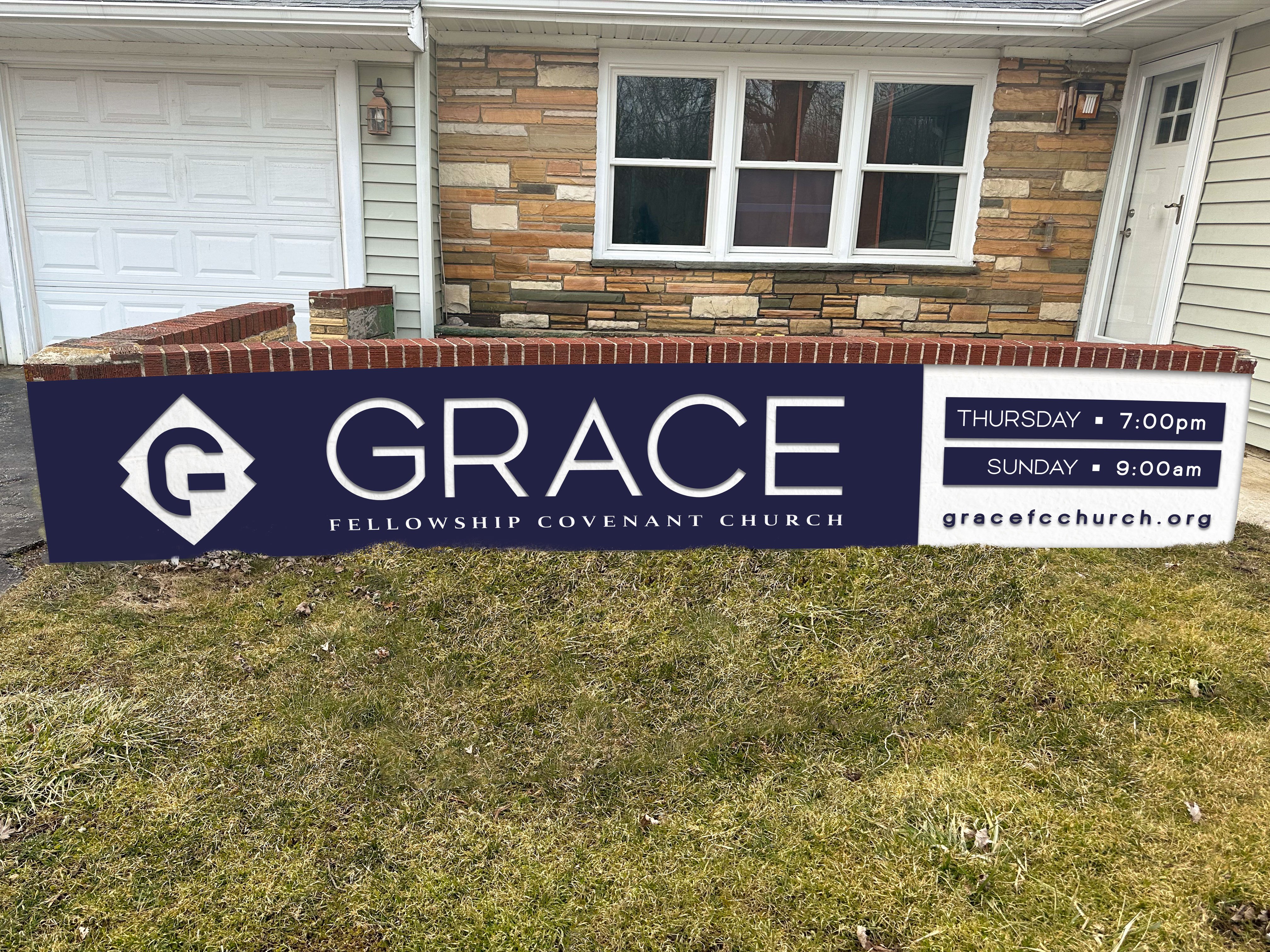
Signage can be utilized far beyond the walls of a church, allowing members to express pride in their place of worship and promote the organization’s message. An outdoor monument sign serves as an excellent option for this purpose. A large sign provides ample space for a church to display its brand and convey important information. As Grace Fellowship focuses on establishing its identity, we incorporated the new logo in both symbol and word form. Blue-purple triangles with connecting squares were added to the edges of the sign, reflecting the essence of this welcoming church.
Apparel that Creates Brand Ambassadors
Branded apparel is a great way to spread a church’s message and build a sense of belonging. T-shirts, sweatshirts, and other clothing help members feel connected while also showcasing the church’s identity in the broader community. Every time a member wears their branded apparel, it reinforces the organization’s mission and sparks curiosity among those who may want to learn more.
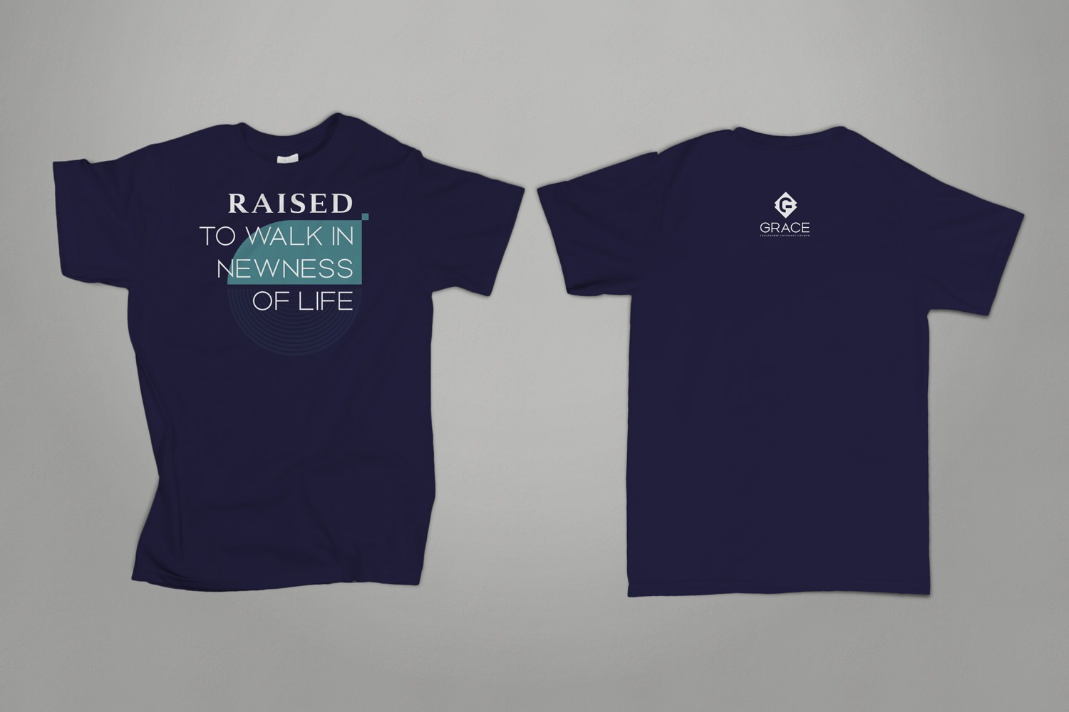
For Grace Fellowship’s t-shirt, we created a design that balances coolness and modernity, encouraging members to wear it proudly at church events and beyond. The shirt features the church’s signature blue-purple as the base color, giving it a bold, standout look. To reflect the church’s mission, we paired sans serif and serif fonts for a fresh but professional feel. The design includes a subtle motif of geometric shapes from the church’s branding, adding depth and staying true to their visual identity. The church’s logo appears on the back of the shirt, allowing the front design to take center stage while reinforcing the overall brand.
Exploring different styles and ideas for your church branding? Check out our collaboration with Echo Community Church: Church Branding Guide & Marketing Materials Examples for ECC. This church was looking to revamp and update their brand while still preserving certain details that reflected their vision and congregation. We worked with the church team every step of the way to create a cohesive brand identity system that will resonate with members for years to come.
At Abstract Union, we know your mission is more than just words—it’s your calling. That’s why we’re passionate about helping churches and organizations like yours share their vision, build community, and create a lasting impact. From innovative logo designs to full-scale branding and outreach solutions, we tailor each project to amplify your unique voice and values. Let’s create a brand that reflects who you are and inspires others to join your journey. Ready to get started? Connect with us today, and let’s bring your mission to life.