


In Sandpoint, ID, Cedar Hills Church stands out as a bold, contemporary presence. Non-denominational and focused on relationships, the church helps people explore how they are designed for connection and purpose. Their culture is welcoming, down-to-earth, and creatively untraditional.
As their congregation has grown, so has the need for physical spaces that match the energy and momentum of their community. To meet that need, the church launched a capital campaign to expand its lobby, breezeway, and outdoor gathering areas—creating more spaces for connection and next-generation ministry. They titled the campaign, "Hold Nothing Back: Giving Our All to the One Who Gave His All," inspired by Corinthians 15:58, "Stand firm. Let nothing move you. Always give yourself fully to the work of the Lord, because you know that your labor in the Lord is not in vain." The message was clear: this campaign was about full participation and shared purpose.
Though the church has excellent in-house designers, they didn't have the bandwidth for another large-scale initiative. They knew this campaign needed dedicated focus and elevated execution. That's when they partnered with Abstract Union to translate their vision into a cohesive and compelling visual language.
To reflect both the church's progressive culture and the forward momentum of their campaign goals, the visuals were grounded in movement, connection, and brand cohesion. We centered the campaign design on dynamic geometric forms—shapes that felt structured and energetic. Diagonal lines introduced a sense of motion and mirrored the church's trajectory toward growth. Half circles, symbolizing community and friendship, anchored the design and subtly echoed Cedar Hills' ethos of connection. Together, these shapes created a visual structure that felt both active and grounded—just like the community it represents.
To build the color palette, we extended the church's existing brand colors—saturated red and turquoise—by introducing a deeper red and a soft cream. These additions brought warmth, contrast, and the ability to create fluid gradient transitions across materials.
For typography, we chose fonts that reflected the varied weights in the church's branding, reinforcing familiarity while allowing clear hierarchy across print and digital assets. The result was a cohesive, recognizable system that supported both bold messaging and thoughtful storytelling.
A Logo to Set the Campaign in Motion
A strong campaign theme logo does more than label an initiative—it sets the tone, builds momentum, and creates a visual rallying point. For Cedar Hills, we created a bold wordmark that captured the energy and direction of the church's next chapter. We used a modern sans-serif font that blends straight and curved edges, striking a balance between structure and openness. The letters are slanted and expanding, giving the logo a sense of forward motion and growth. These details worked together to create a mark that feels just like Cedar Hills itself—dynamic, welcoming, and ready for what's next.

Make Momentum with a Booklet & One-Pager
A church's vision for its space and people is rarely simple, and helping donors understand it clearly is essential. We custom-designed a case statement booklet that draws readers in, deepens engagement, and invites them into what God is building next.
For Cedar Hills, we created a larger-format booklet (8.5 x 11 inches) that gave the content room to breathe, inspire, and connect. Bold color contrasts helped organize the layout and draw attention to what mattered most. Half circles were sparingly used to frame moments like member portraits and building renderings, adding structure without distracting from the story being told. Alongside the campaign overview and goals, we also included a weekly devotional guide. That addition helped the campaign become more than an initiative—it became something to reflect on, pray through, and step into with purpose.

While the full booklet offered depth, we also created a one-pager for moments when something more concise was needed, like after donor meetings or informal presentations. This piece captured the heart of the campaign in a compact, easy-to-read format that was both inviting and informative.
Rounded corners softened the layout, while intentional color blocking guided the eye and organized key details. A clear text hierarchy led readers naturally through both sides of the page, leaving them curious and ready to explore more. It became more than a summary—it became a spark of interest, an open door into the bigger story.
Together, these case statement materials gave Cedar Hills the flexibility to communicate with depth when needed, and simplicity when it mattered most.

A Pledge Card & Envelope to Put Giving into Action
Once donors had a chance to reflect and pray about their role in the campaign, they were ready to make their giving plan visible. We designed the pledge card for Cedar Hills to make that next step intentional and straightforward—turning the campaign's energy into action.
The folded card measured 7 x 10 inches, giving people plenty of space to review their commitment and fill in key details without feeling rushed. We used the cream tone from the campaign palette to create soft, open areas for writing, and kept the layout clean and easy to follow. Layered design elements added depth and subtly guided the reader's eye through each section.

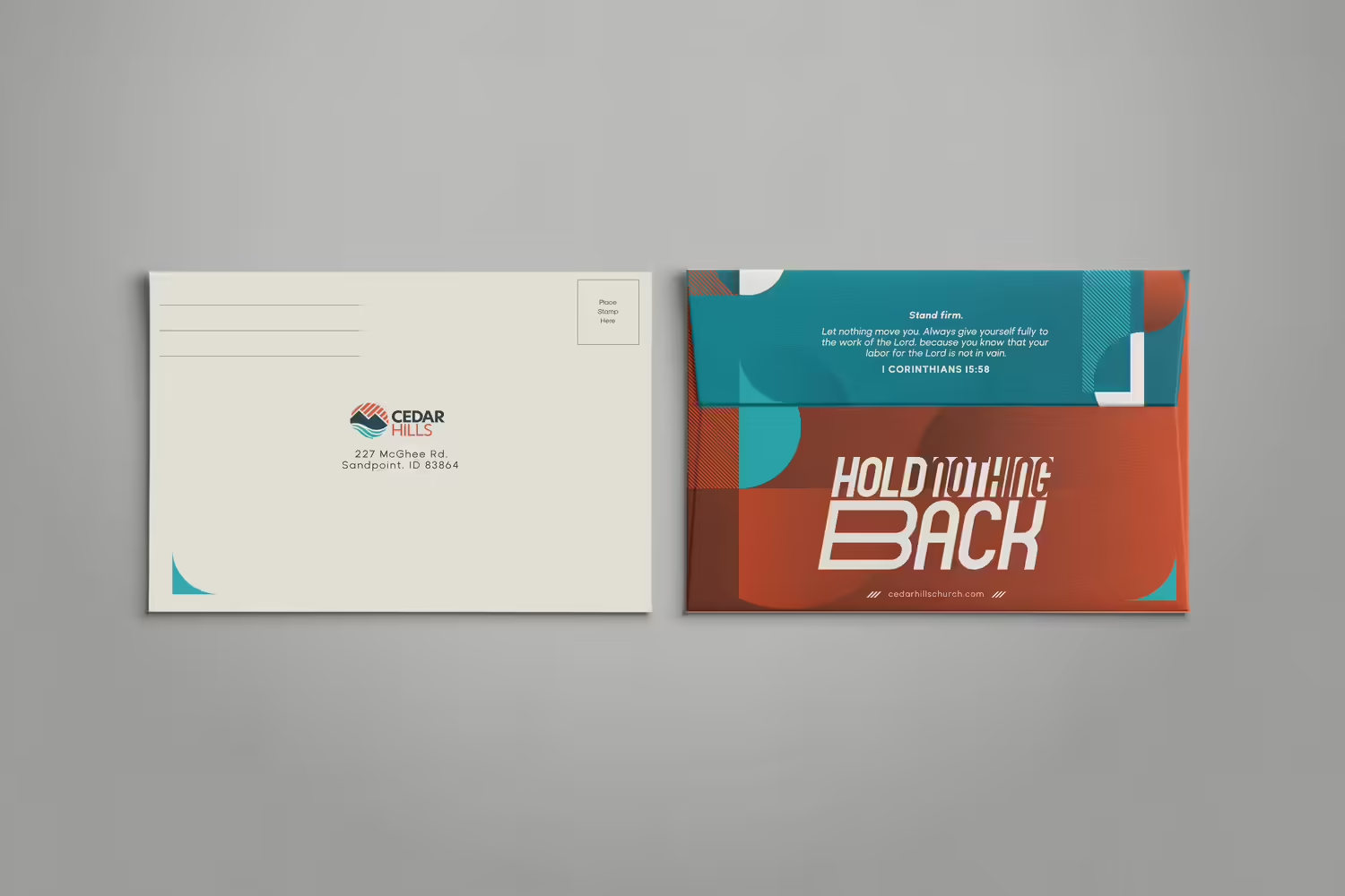
To make the return process easier and feel just as intentional, we designed a return envelope that matched the energy and excitement of contributing to the campaign. Visual contrast played a key role. The front remained clean and straightforward, with a cream background and a single curved corner detail that added a subtle touch of personality. Flip it over, and the back comes alive: full red coverage, a turquoise flap, and layered half-circle motifs. Gradients added depth and movement, bringing a sense of vibrancy to even this smallest piece.
Whether handed out during Sunday services or a donor presentation, the pledge card and return envelope brought the campaign to a personal level—easy to engage with, visually striking, and ready to turn intention into action.
Expand Your Reach with a Slide Deck & Sermon Series
Capital campaign materials don't end with print. Digital assets play a huge role in how the message shows up—during worship, presentations, and everyday moments of connection. Whether it's a slide on a Sunday morning or part of a donor meeting, these tools help keep the message consistent and make the initiative feel active and present throughout its duration.
For moments when specific updates or details needed to be shared, we designed a slide deck that felt bold, cohesive, and easy to update. We leaned into the saturated tones of the campaign palette for background slides, giving them energy and contrast that translated well on screens. Two overlapping half-circles served as a unifying motif across the deck, visually linking each slide to the next. We were intentional about how we used design elements—adding multiple layers on title and subtitle slides while keeping content-heavy layouts light and flexible—giving the Cedar Hills team space to customize for different settings.
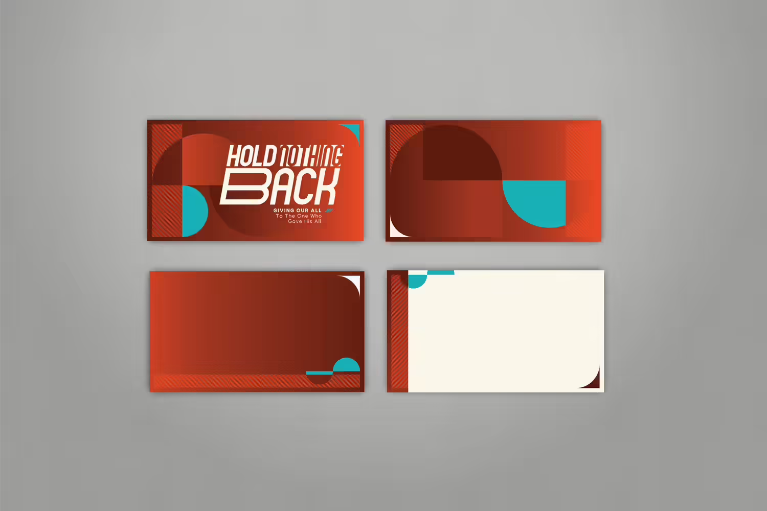
Alongside the main presentation deck, Cedar Hills also needed weekly sermon graphics to support a series that ran alongside the campaign. This series gave members a deeper way to reflect on connection—with God and with one another—and helped frame the campaign in both a spiritual and relational context.
We kept the text large and readable, using the campaign's logo font for strong visual continuity. Diagonal lines added movement to each layout, guiding the viewer's eye and reinforcing the campaign's sense of forward momentum. We also featured images of church members and included QR codes, giving people a direct way to engage with the campaign's goals and take their next step.

A Banner that is Presentation-Ready
There are many places where a team can present a capital campaign. A retractable banner is an excellent tool that provides a strong visual presence wherever it's displayed—whether in a church foyer on a Sunday or at a donor event.
For Cedar Hills, we kept the banner design focused and minimal so the most essential details could shine. The campaign logo sat at the top, making it easy to recognize even from a distance. In the center, we highlighted 1 Corinthians 15:58—a reminder that every effort matters, and an invitation for everyone in the church to take part. At the bottom, we added a building rendering, offering a glimpse of what could be possible with their support.

A Walking Ambassador with a T-Shirt
Merch can be one of the most versatile tools for a capital campaign—it creates visibility, sparks conversation, and serves as a reminder of what donors are part of. We designed a custom t-shirt for Cedar Hills that could be used across the board—by volunteers, leadership teams, and donors.
We printed on black shirts for strong contrast and used the campaign's teal and cream tones for the artwork. The front was kept intentionally minimal to spark curiosity. On the back, we went bolder: half-circles and rounded forms in various sizes were arranged together, creating an entirely new motif. We wove campaign keywords into the design—small reminders of the values driving the initiative and what makes it worth investing in.
These shirts became more than just a launch-day accessory. They became a way for the campaign's goals to move off the page and into the community's daily rhythm.

Our partnership with Cedar Hills shows what happens when a capital campaign is approached as more than a fundraiser. When every design element is built with purpose, the campaign becomes something people can see themselves in. Something they can carry with them.
Cedar Hills already had talented designers on staff. What made this project meaningful was the trust they placed in us to take something big and run with it. They knew this campaign would require time, creative energy, and full attention—so they handed it off, and we stepped in as an extension of their team. We deeply value that kind of partnership. Whether a church has a full creative department or is working with a small team, we know how to come alongside and build something custom—something that fits their voice, their people, and their goals.
If you're looking for another example of a bold, brand-aligned campaign, take a look at our work with Dominion Church: Bold Materials for Capital Campaign Building Expansion. Like Cedar Hills, they wanted something modern, energetic, and deeply connected to who they are as a congregation. We were also tasked to make materials that aligned with their brand, having a familiar feel but able to stand on its own as a fresh initiative.
Every church has a story to tell, especially in a season of growth. Whether you're working with a full creative team or just starting to imagine what's next, we're here to help you bring it to life with design that fits your people, your space, and your goals. Let's build something bold together.


